Build a free Google Sheets dashboard without coding
Building a functional dashboard from scratch in Google Sheets is achievable, and you can find a great Google Sheets dashboard template free.
A single IMPORTRANGE formula can break an entire dashboard if its permissions aren't set correctly, leading to a cascade of #REF! errors. Building a functional dashboard from scratch in Google Sheets is absolutely achievable, and you can find a great Google Sheets dashboard template free to get you started without reinventing the wheel. Many templates offer pre-built charts and data tables that just need your specific information plugged in.
The core challenge with dashboards, whether free or paid, is not just presentation but also data integrity and ease of use. A good dashboard should simplify complex data, making it actionable at a glance. For instance, if you're tracking marketing campaigns, you don't want to spend hours manually pulling metrics; you want to see performance trends immediately.
Understanding Dashboard Essentials
At its heart, a dashboard is a visual display of the most important information needed to achieve one or more objectives, displayed on a single screen. For spreadsheets, this means translating raw data into charts, graphs, and summary statistics that tell a clear story. Key components typically include:
- Data Source: This is where your raw information lives, whether it's a single sheet, multiple linked sheets, or even external data pulled in via
IMPORTRANGEor other connectors. - Data Processing/Calculations: This layer involves formulas that clean, transform, and calculate metrics from your raw data. Think
SUMIFS,AVERAGEIFS,VLOOKUP,XLOOKUP, and even pivot tables. - Visualizations: Charts (bar, line, pie, scatter), sparklines, conditional formatting, and strategically placed summary numbers that highlight key trends and outliers.
- Interactivity (Optional): Features like dropdowns for filtering data, slicers, or even simple buttons to refresh data can make a dashboard more dynamic.
Leveraging Existing Templates
Searching for a Google Sheets dashboard template free is a smart move for several reasons. You save significant time on setup and design, allowing you to focus immediately on populating it with your own data and interpreting the results. These templates often come with pre-configured charts and a logical structure that you can adapt.
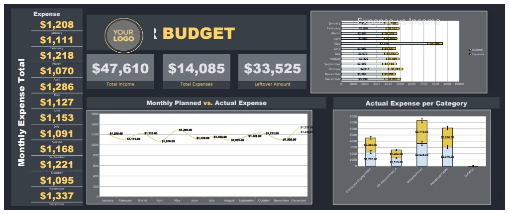
For example, if your primary need is to understand financial performance, a template like the Profit and Loss Dashboard can provide immediate insights into revenue, cost of goods sold, gross profit, and operating expenses. It typically includes charts that visualize trends over time, making it easy to spot seasonal fluctuations or areas of concern. Similarly, if you manage a team or department, a HR Budget Dashboard Template can be invaluable for tracking headcount, salaries, benefits costs, and training expenses against allocated budgets.
Building Your Own Dashboard: Key Steps
If you decide to build a dashboard from scratch or heavily customize a free template, follow these steps for a structured approach:
- 01Define Your Objectives: What questions do you need your dashboard to answer? What key performance indicators (KPIs) are most critical for your decision-making? Be specific. Instead of "track sales," aim for "track monthly sales revenue by region" or "monitor customer acquisition cost by marketing channel."
- 02Identify Your Data Sources: Where does the data reside? Is it already in Google Sheets, or does it need to be imported from elsewhere? Ensure your data is clean and consistently formatted.
- 03Structure Your Data Sheets: Organize your raw data into logical tables. Use clear headers, avoid merged cells in data areas, and ensure each row represents a single record. A common practice is to have a dedicated "Data" or "Raw Data" sheet.
- 04Create a Calculation/Metrics Sheet: This sheet will house all your intermediate calculations and final metrics. This keeps your raw data clean and your dashboard visualizations uncluttered. Use formulas like
SUMIFSto aggregate data based on specific criteria. For instance, to sum sales for a particular month and region, you might use=SUMIFS(SalesData!C:C, SalesData!A:A, "January", SalesData!B:B, "North"), assuming your sales data is in column C and your month/region data are in columns A and B. - 05Design Your Dashboard Sheet: This is where your visuals will live. Start by adding summary numbers for your most critical KPIs. Then, incorporate charts that best represent your data (e.g., line charts for trends over time, bar charts for comparisons).
- 06Link and Format: Use formulas to pull your calculated metrics from the calculation sheet onto the dashboard sheet. Apply conditional formatting to highlight important thresholds or anomalies. Ensure consistent fonts, colors, and spacing for a professional look.
- 07Test and Refine: Populate the dashboard with a range of data, including edge cases, to ensure all formulas and visualizations work as expected. Get feedback from potential users.
Common Pitfalls to Avoid
Many users encounter frustration with dashboards, often due to a few recurring mistakes. Being aware of these can save you a lot of headaches.
- Overcrowding: Trying to display too much information on one screen leads to a cluttered, overwhelming dashboard that defeats its purpose. Focus on the most important metrics.
- Poor Data Hygiene: Inconsistent data entry, typos, or incorrect formatting in your source data will propagate errors throughout your dashboard. Garbage in, garbage out.
- Ignoring Data Structure: Merged cells, blank rows/columns within data tables, or inconsistent headers make it very difficult for formulas to process your data correctly.
- Complex Formulas on the Dashboard: While some direct calculations are fine, performing heavy data aggregation directly on the dashboard sheet can slow down performance and make troubleshooting harder. A dedicated calculation sheet is often best.
- Lack of Clear Objectives: Building a dashboard without knowing precisely what questions it needs to answer results in a collection of charts that may look nice but provide little actionable insight.
Customizing and Enhancing Your Dashboard
Once you have a basic Google Sheets dashboard template free set up, you can enhance it significantly. For instance, if you're tracking website traffic or social media engagement, you might want to add date range selectors. This can be done using data validation dropdowns for start and end dates, and then incorporating these dates into your SUMIFS or QUERY formulas.
For more advanced filtering, consider using the QUERY function. It's incredibly powerful for pulling specific subsets of data and can even perform aggregations. For example, to pull sales data for a specific region from a sheet named 'SalesData' with region in column B and sales in column C: =QUERY(SalesData!B:C, "SELECT SUM(C) WHERE B = 'North' LABEL SUM(C) ''", 1). This is far more flexible than multiple SUMIFS for complex criteria.
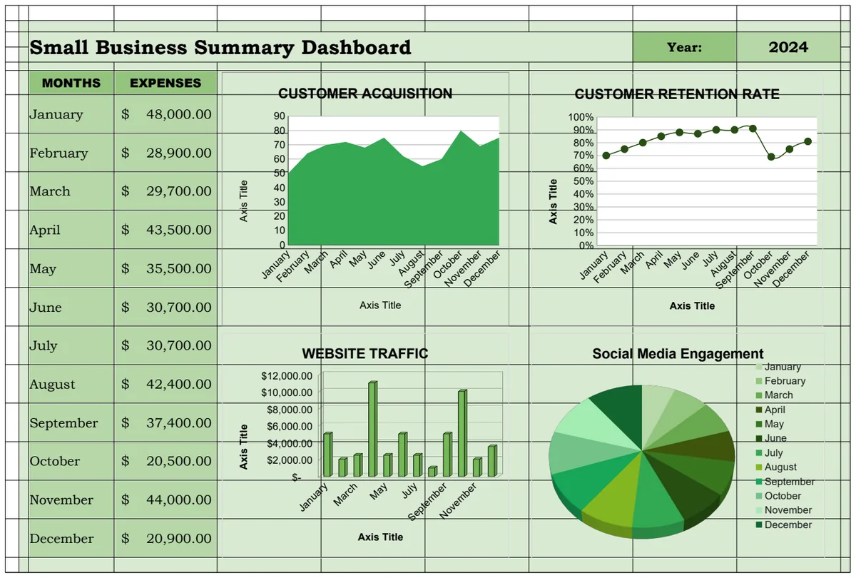
If you are managing projects or marketing campaigns, a template like the Social Media Posting Plan Template with Dashboard can be a great starting point. You can then extend its functionality by adding formulas to calculate engagement rates, cost per click, or other relevant metrics, and visualize these alongside your planned posts.
Making Data Interactive
Interactivity significantly boosts a dashboard's utility. You can add dropdown menus to select specific products, regions, or time periods. For example, on your dashboard sheet, you might have a cell (say, B2) with a data validation list of regions. Then, in your calculation sheet, you'd modify your SUMIFS to reference this cell: =SUMIFS(SalesData!C:C, SalesData!B:B, Dashboard!$B$2). This allows users to change the region in cell B2 on the dashboard, and all related metrics and charts will update automatically.
Conditional Formatting for Impact
Conditional formatting is your friend for drawing attention to what matters. Instead of just showing a number, use it to color-code cells. For example, if you're tracking inventory levels, you could set a rule: if the inventory count in cell D5 is less than 10, format the cell red; if it's between 10 and 20, format it yellow. This visual cue immediately flags low stock without requiring users to scan every number.
Expanding Beyond Free Templates
While a Google Sheets dashboard template free is a fantastic starting point, remember that for more complex needs, or if you require a higher level of polish and advanced features, there are paid options available. For a one-time fee of $9, you gain access to an extensive library of templates that can save you countless hours and provide professional-grade solutions. However, the principles and techniques discussed here apply universally, whether you're using a free template or building from scratch.
Frequently Asked Questions
How do I link data from another Google Sheet?
You use the IMPORTRANGE function. The syntax is =IMPORTRANGE("spreadsheet_url", "sheet_name!range"). For example, =IMPORTRANGE("https://docs.google.com/spreadsheets/d/123abc...", "Sheet1!A1:D100"). The first time you use it, you'll need to grant permission for the sheets to communicate.
Can I use pivot tables in my dashboard?
Absolutely. Pivot tables are excellent for summarizing large datasets. You can create a pivot table on a separate sheet and then link the summary data from the pivot table to your dashboard visualizations. This keeps your dashboard sheet clean and performant.
How do I make my dashboard update automatically?
Google Sheets generally updates formulas automatically as the source data changes. For IMPORTRANGE, there might be a slight delay as it fetches external data. If you need more real-time updates, you might explore Google Apps Script, but for most dashboard use cases, the default automatic updates are sufficient.
What if my data is too large for Google Sheets?
If you're dealing with millions of rows or extremely complex calculations that slow down your sheet significantly, you might need to consider more robust solutions like Google Data Studio (now Looker Studio), a dedicated business intelligence tool, or a database. However, for many small to medium-sized datasets, Google Sheets remains a powerful and accessible option.