Excel vs. Google Sheets: Which free financial dashboard wins?
Discover the best free financial dashboard template for Excel or Google Sheets to gain instant clarity on your business's financial health.
Manually compiling financial data into spreadsheets daily is a losing battle. Building a functional financial dashboard template in Excel from scratch, while possible, often takes longer than the insights it provides are worth. A well-designed financial dashboard template Excel free, readily available, offers immediate clarity on your business's financial health. It’s about seeing trends, not just numbers.
Instead of wading through rows of raw data, a dashboard presents key performance indicators (KPIs) visually. Think of charts and graphs that instantly communicate revenue growth, expense breakdowns, or profit margins. This allows you to make faster, more informed decisions. You're looking for a way to get this clarity without a steep learning curve or upfront cost, and that's precisely what a good template provides.
Why a Dashboard Beats Raw Spreadsheets
Imagine opening your accounting spreadsheet and seeing 5,000 rows of transactions. To understand your profit margin for last quarter, you’d need to manually sum revenues, sum expenses, and then calculate the percentage. This process is time-consuming and prone to errors. More importantly, it doesn't show you trends. Are sales increasing month-over-month? Are specific expense categories creeping up unexpectedly?
A financial dashboard, on the other hand, displays this information graphically. A line chart might show revenue climbing steadily, while a pie chart could highlight that 30% of your expenses are tied to marketing. This visual summary is far more powerful. It allows you to spot anomalies, identify strengths, and pinpoint weaknesses at a glance. This is the core advantage of using a financial dashboard template Excel free; it turns data into actionable intelligence.
Essential Components of a Financial Dashboard
A truly useful financial dashboard needs to go beyond just displaying numbers. It should provide context and allow for some level of interaction. Here are the key elements you should look for, or aim to build:
- Key Performance Indicators (KPIs): These are the critical metrics that define your business's success. For financial dashboards, this typically includes:
- Revenue (Total, Year-over-Year Growth)
- Gross Profit Margin
- Net Profit Margin
- Operating Expenses (Total, by category)
- Cash Flow
- Accounts Receivable/Payable
- Visualizations: Charts and graphs are the heart of a dashboard. Common types include:
- Line charts for trends over time (e.g., monthly revenue).
- Bar charts for comparisons (e.g., expenses by department).
- Pie charts for proportions (e.g., revenue sources).
- Scorecards for single, important numbers (e.g., current cash balance).
- Data Input Sheet: Where you'll feed your raw financial data. This should be organized clearly, often with columns for date, category, amount, and description.
- Summary/Calculation Sheet: This sheet will house the formulas that pull data from your input sheet and perform calculations for your KPIs.
- Dashboard Sheet: This is the visually appealing front-end, populated with charts and KPI readouts linked to the summary sheet.
Building Your Own: A Quick Walkthrough
If you're starting from scratch or want to customize an existing template, here's a simplified process. This assumes you have your raw financial transactions in a sheet named Transactions with columns: Date, Category, Description, and Amount.
- 01Create a `Summary` Sheet:
- In cell
A1, typeMetric. - In cell
B1, typeValue. - In cell
A2, typeTotal Revenue. - In cell
A3, typeTotal Expenses. - In cell
A4, typeNet Profit. - In cell
A5, typeProfit Margin (%).
- 02Add Formulas for KPIs:
- In cell
B2(Total Revenue), enter the formula:=SUMIF(Transactions!$B:$B, "*Revenue*", Transactions!$D:$D) - This formula sums all amounts in the
Amountcolumn (Transactions!$D:$D) where theCategorycolumn (Transactions!$B:$B) contains the word "Revenue". Adjust "Revenue" if your category names differ. - In cell
B3(Total Expenses), enter:=SUMIF(Transactions!$B:$B, "<>*Revenue*", Transactions!$D:$D) - This sums all amounts where the category is not "Revenue". You might want to refine this to sum specific expense categories, e.g.,
=SUMIFS(Transactions!$D:$D, Transactions!$B:$B, "Rent") + SUMIFS(Transactions!$D:$D, Transactions!$B:$B, "Utilities"). - In cell
B4(Net Profit), enter:=B2-B3 - In cell
B5(Profit Margin), enter:=IFERROR(B4/B2, 0) - Format cell
B5as a percentage. TheIFERRORhandles cases whereB2might be zero, preventing a division-by-zero error.
- 03Create a `Dashboard` Sheet:
- Insert a Chart. Choose a simple bar chart.
- Select your data. For a quick start, you could select cells
A2:B5from yourSummarysheet. Excel will create a basic chart. - You can then add more charts for specific categories or trends. For instance, to show monthly revenue, you’d need to create a helper table in your
Summarysheet that aggregates revenue by month using formulas like=SUMIFS(Transactions!$D:$D, Transactions!$A:$A, ">="&DATE(YEAR(TODAY()),MONTH(A1),1), Transactions!$A:$A, "<="&EOMONTH(DATE(YEAR(TODAY()),MONTH(A1),1),0)), whereA1contains a month number.
This basic structure gives you a foundation for a financial dashboard template Excel free.
Common Pitfalls to Avoid
Many users fall into predictable traps when building or using financial dashboards. Recognizing these can save you significant frustration.
- Over-complication: Trying to cram too much information onto one screen. A dashboard should be digestible. If it requires a magnifying glass or extensive scrolling, it's not effective. Focus on the most critical KPIs.
- Poor Data Hygiene: If your raw data is messy, inconsistent category names, missing entries, incorrect amounts, your dashboard will be inaccurate. Implement strict data entry protocols.
- Lack of Context: Displaying a number like "$10,000 in expenses" is meaningless without context. Is that up or down from last month? How does it compare to budget? Ensure your charts and KPIs have comparative elements.
- Static Data: A dashboard that isn't updated regularly becomes obsolete quickly. Automate data import or establish a routine for manual updates.
- Ignoring Trends: Focusing only on the current snapshot and neglecting to visualize trends over time. Growth, decline, and seasonality are critical insights that dashboards Excel at revealing.
Ready-Made Templates for Instant Clarity
While building your own is educational, sometimes you need a solution now. Leveraging a pre-built financial dashboard template Excel free can accelerate your understanding and decision-making process significantly. These templates are often designed by finance professionals and have accounted for common reporting needs.
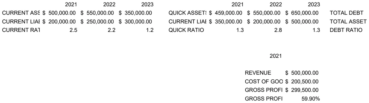
For instance, if your business is primarily focused on IT services, a specialized tool like the IT Financial Ratio Analysis Template can provide immediate insights into profitability, liquidity, and efficiency ratios specific to that industry.
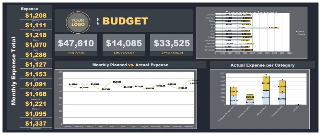
If you're looking for a broader overview that covers budgeting and expense tracking alongside core financial performance, the Annual Budgeting Dashboard Template offers a multi-year perspective with detailed monthly breakdowns and visual summaries.
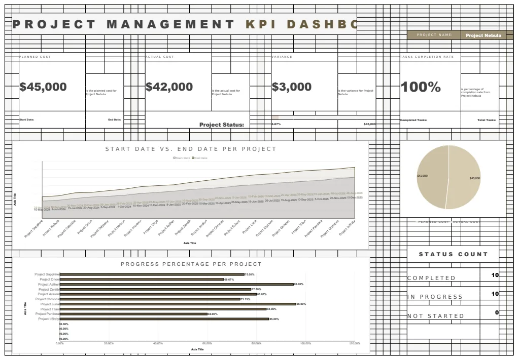
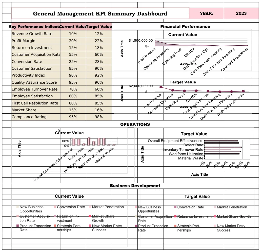
Even a general-purpose Financial Dashboard Template can provide a robust starting point for tracking product performance and overall financial health with automated charts and summaries. And for simpler income/expense tracking with visual oversight, another Financial Dashboard Template is available. These templates are designed to give you that financial dashboard template Excel free experience, providing instant value.
Frequently Asked Questions
How often should I update my financial dashboard?
The ideal update frequency depends on your business's transaction volume and how quickly your financial situation changes. For many small to medium-sized businesses, updating weekly or bi-weekly provides a good balance between timely information and effort. For very active businesses, daily updates might be necessary. The key is consistency.
Can I use these templates for personal finance?
Absolutely. The principles of financial dashboards apply equally to personal finances. You can adapt templates to track income from various sources, monitor spending categories, and visualize savings goals. It's an excellent way to get a clear picture of your personal financial health.
What if my Excel version is older?
Most modern dashboard templates utilize features available in Excel 2013 and later. However, some advanced visualization techniques or newer functions might not be supported in very old versions (e.g., Excel 2007 or 2010). If you encounter compatibility issues, you might need to update your Excel software or look for templates specifically designed for older versions, though these are becoming less common. The core concepts of data aggregation and charting remain consistent.