Category
Data Analysis & Visualization
Charts, diagrams, and statistical visuals for reporting data.
121 templates
 Data Analysis & Visualization
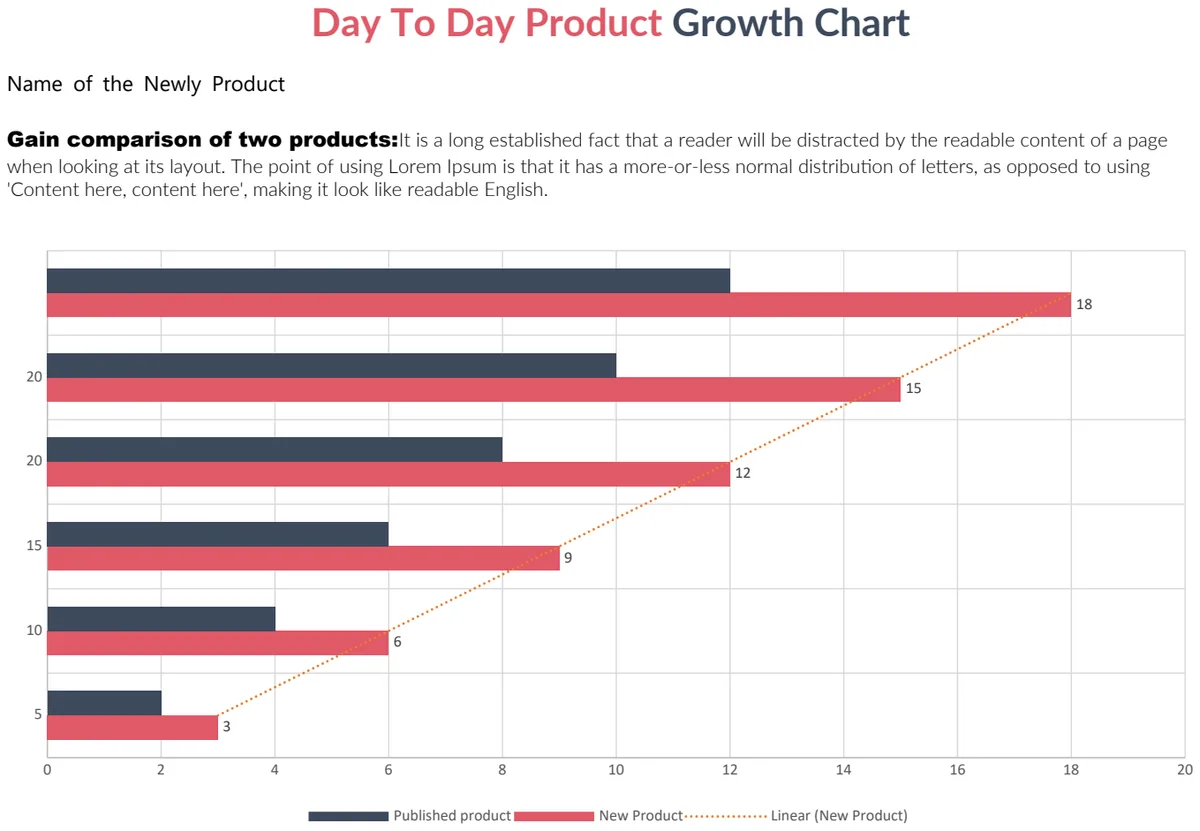
Day To Day Product Growth Chart
Compare daily growth metrics for two products with visual trend tracking and side-by-side performance analysis.
- Day-by-day growth chart
- Dual-product comparison view
- Visual trend lines
 Data Analysis & Visualization
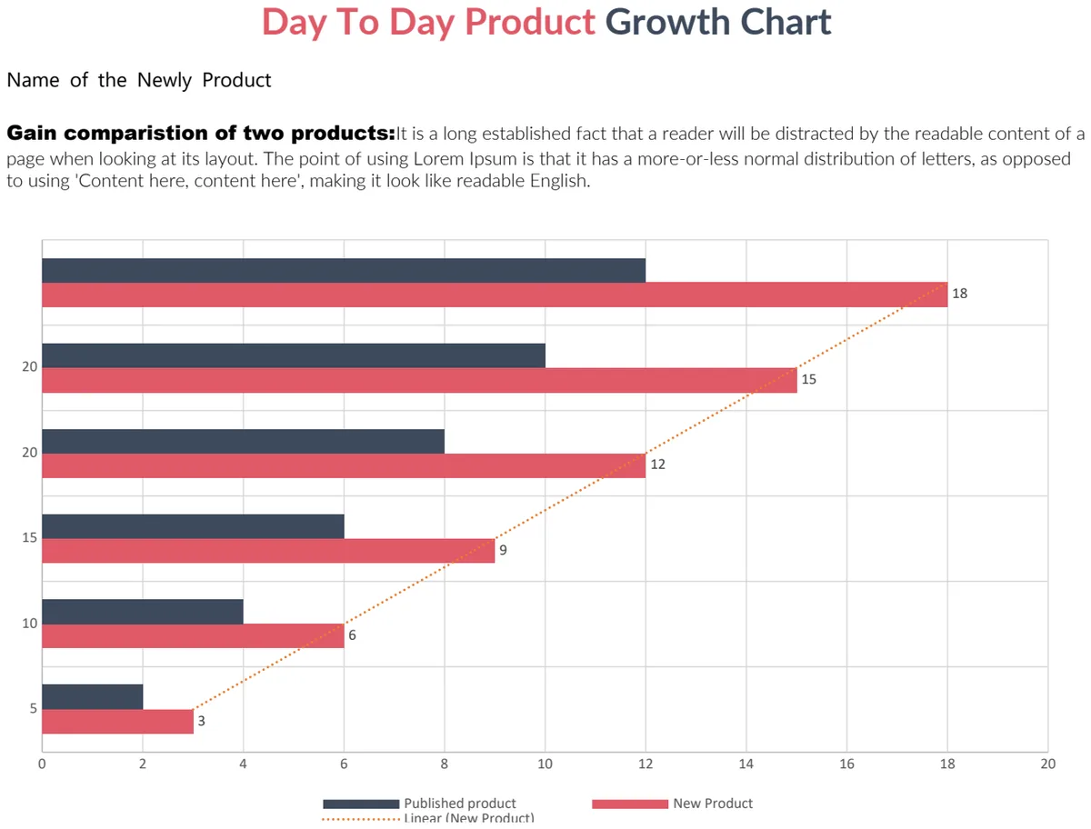
Day To Day Product Growth Chart
Track daily product growth metrics and compare performance between two products with visual charts.
- Day-by-day growth tracking
- Two-product comparison view
- Visual chart representation
 Data Analysis & Visualization
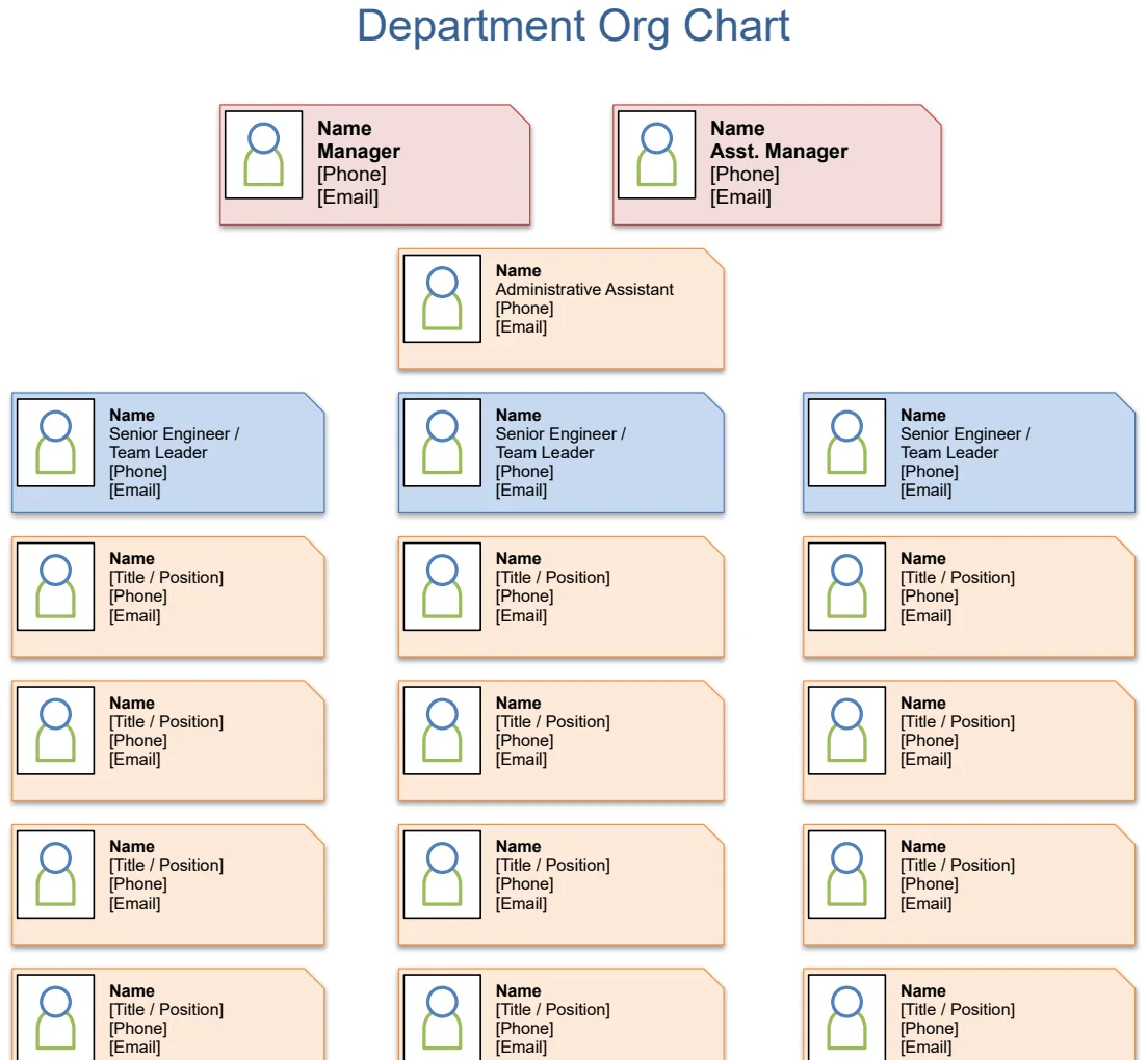
Department Org Chart
Visualize your department structure with an interactive organizational chart template.
- Pre-built organizational chart layout
- Customizable department and role fields
- Visual hierarchy display
 Data Analysis & Visualization
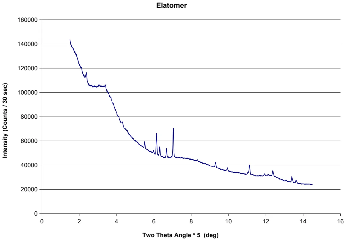
Elasticity Analysis Chart
Visualize elasticity relationships with dynamic charts to understand demand and pricing behavior.
- Pre-built elasticity calculation framework
- Dynamic linked charts
- Sample data structure with price-quantity pairs
 Data Analysis & Visualization
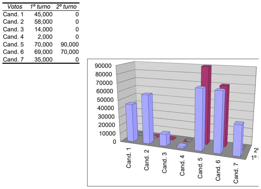
Election Results Tracker
Track and compare voting results across multiple rounds with visual charts for candidate performance analysis.
- Two-round voting columns for primary and secondary results
- Candidate name and vote count rows
- Built-in charts to visualize vote distribution
 Data Analysis & Visualization
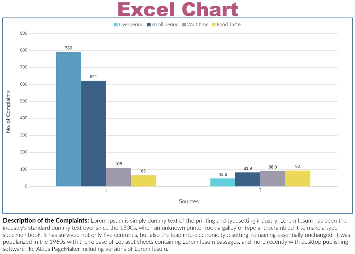
Excel Chart
Create professional data visualizations with built-in chart templates for reports and dashboards.
- Pre-built chart templates
- Data-driven visualization
- Professional formatting
 Data Analysis & Visualization
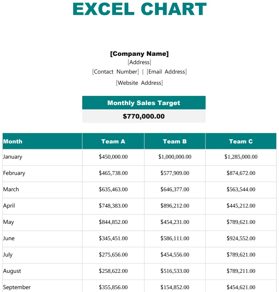
Excel Chart Template
Create professional data visualizations and charts to present metrics and trends clearly.
- Chart structure template
- Company branding fields
- Pre-formatted chart area
 Data Analysis & Visualization
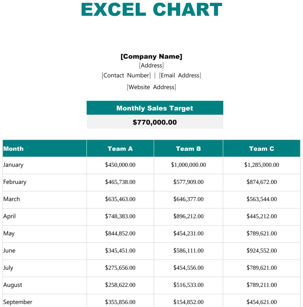
Excel Chart Template
Create professional charts and graphs to visualize data trends and comparisons.
- Pre-formatted chart structure
- Company name and address header
- Professional chart layout
 Data Analysis & Visualization
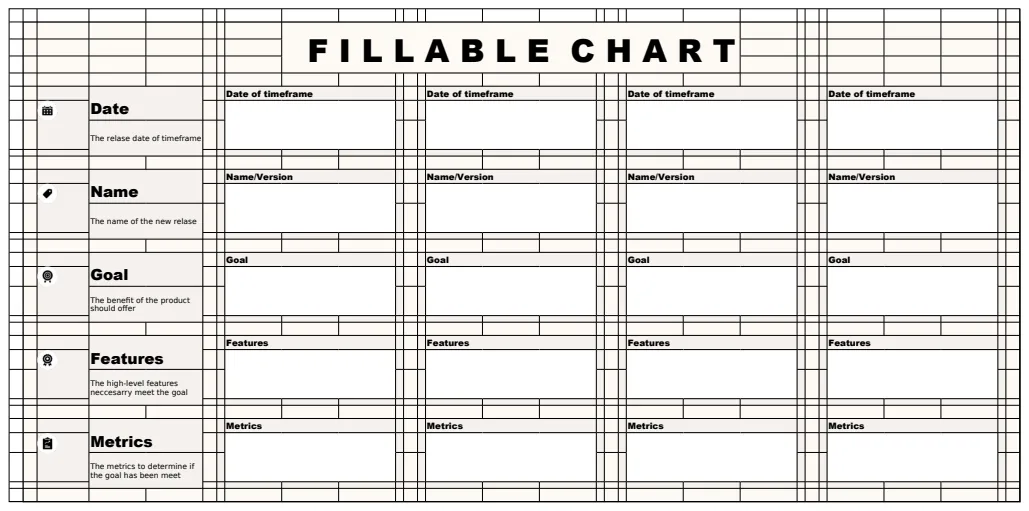
Fillable Chart Template
A customizable chart template for organizing and tracking data across multiple categories and timeframes.
- Customizable column headers
- Sample data structure with Date, Timeframe, and Name fields
- Fillable cells for manual data entry
 Data Analysis & Visualization
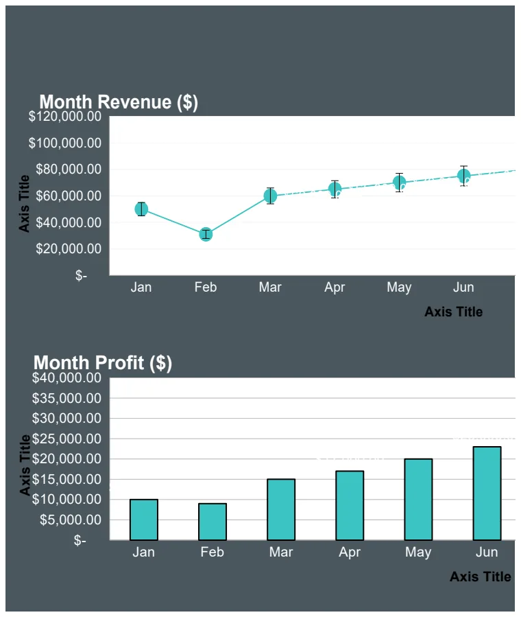
Finance Graph Template
A financial performance visualization template that displays revenue, expenses, profit, and gross margin metrics across months using charts and formulas.
- Month-by-month financial data tracking
- Revenue and expense columns
- Automatic profit calculation using IF formulas
 Data Analysis & Visualization
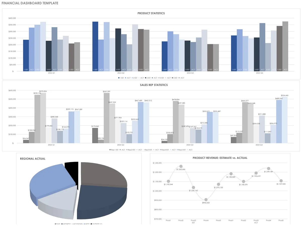
Financial Dashboard Template
Track financial performance with product statistics and visual charts for better decision-making.
- Product statistics tracking
- Automatic SUM calculations
- Visual chart representations
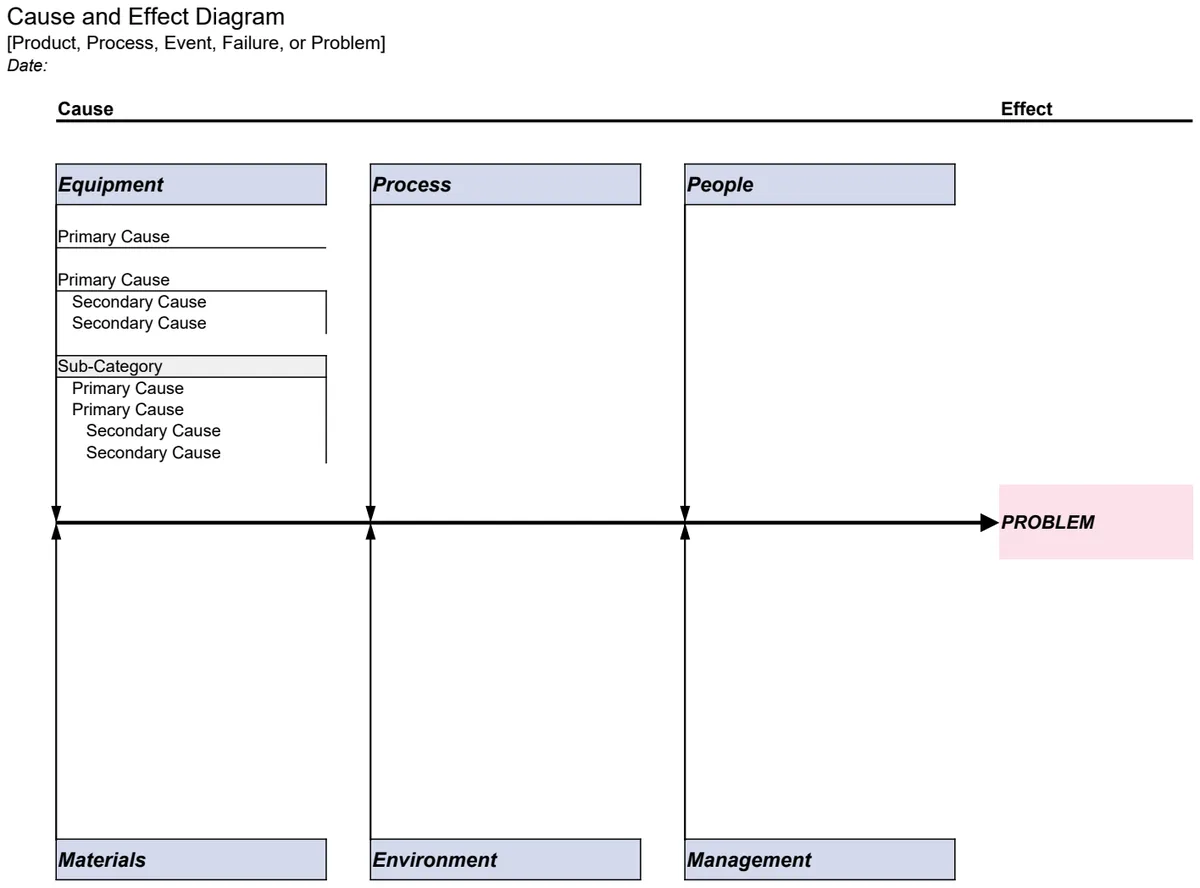 Data Analysis & Visualization
Fishbone Diagram - Cause & Effect Analysis
Identify root causes and effects visually with structured fishbone and outline templates.
- Visual fishbone diagram template
- Outline view for structured cause documentation
- Flexible row insertion and removal
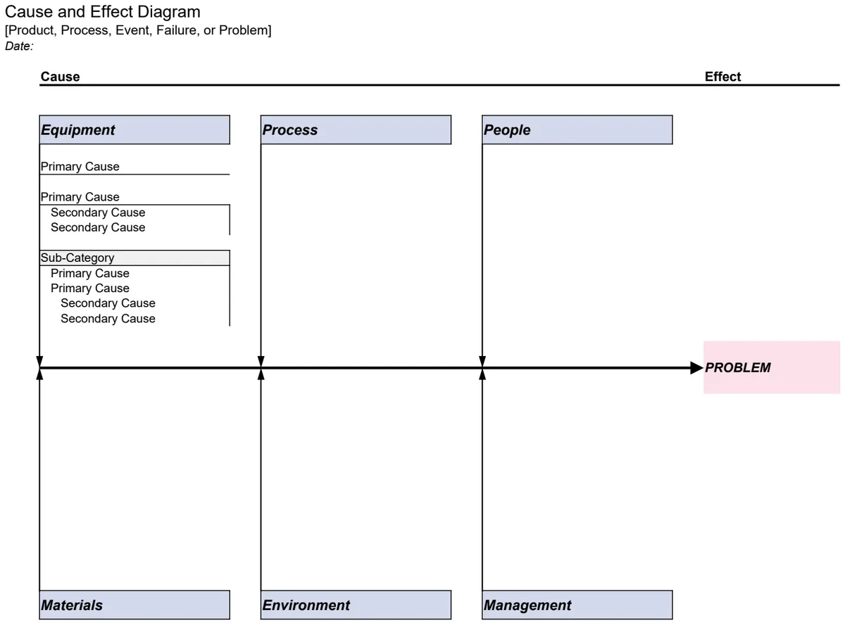 Data Analysis & Visualization
Fishbone Diagram Template
Identify root causes and effects with structured cause-and-effect analysis visualizations.
- Fishbone diagram visualization with main and sub-branches
- Outline view for hierarchical cause-and-effect organization
- Customizable cause categories and effect tracking
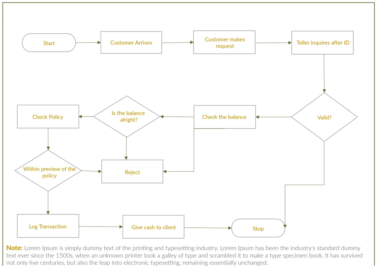 Data Analysis & Visualization
Flow Chart Template
Visualize processes and decision flows with shapes, connectors, and decision points for clarity.
- Pre-shaped connectors and decision boxes
- Process flow symbols and annotations
- Easy directional arrows
 Data Analysis & Visualization
Graph Paper Templates
Multi-grid graph paper in various scales for sketching, planning, and technical drawing.
- Multiple grid sizes (10px, 15px, 20px)
- Isometric grid options for 3D drawing
- Name and date fields for organization
 Data Analysis & Visualization
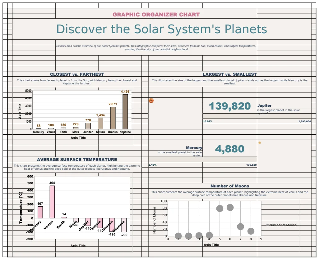
Graphic Organizer Chart Template
A template for creating visual graphic organizers with planetary data and dynamic charts to compare Solar System characteristics.
- Dynamic data lookup with XLOOKUP
- Statistical calculations (MAX, MIN)
- Sparkline visualizations
 Data Analysis & Visualization
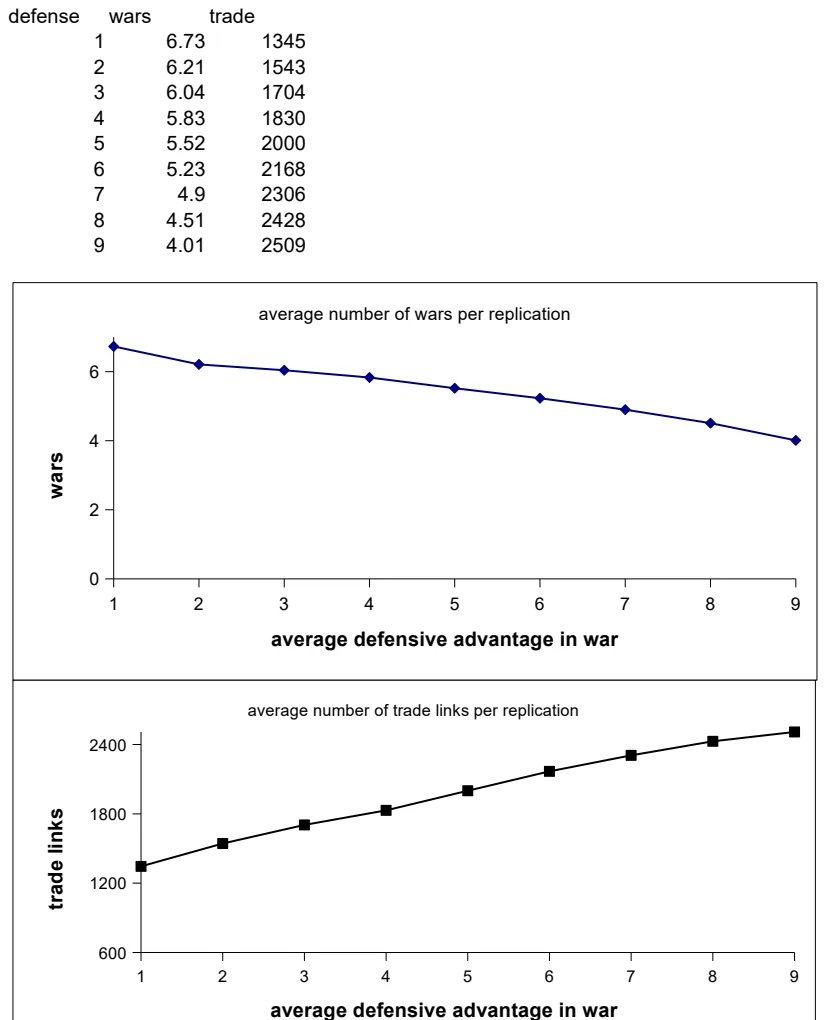
Historical Defense, Wars & Trade Analysis
Track and visualize historical defense spending, warfare events, and trade volumes with built-in charts.
- Organized columns for defense, wars, and trade metrics
- Pre-built charts for trend visualization
- Time-series data structure
 Data Analysis & Visualization
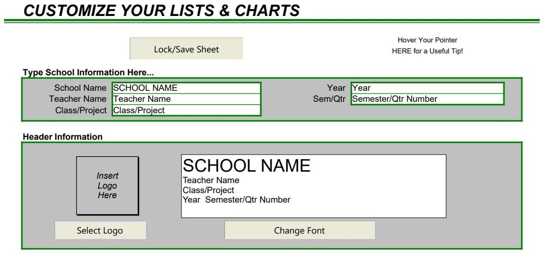
Lists and Charts
Create customizable lists, grids, and monthly records with built-in charting and locking controls.
- Customizable list templates
- Built-in charting functionality
- Plain grid option for flexible data entry
 Data Analysis & Visualization
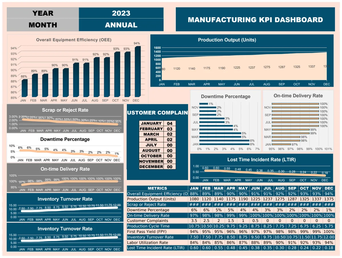
Manufacturing KPI Dashboard Template
Track and visualize key manufacturing performance indicators (KPIs) across monthly periods with real-time status monitoring.
- Monthly metric tracking
- Overall Equipment Efficiency (OEE) monitoring
- Current vs. target value comparison
 Data Analysis & Visualization
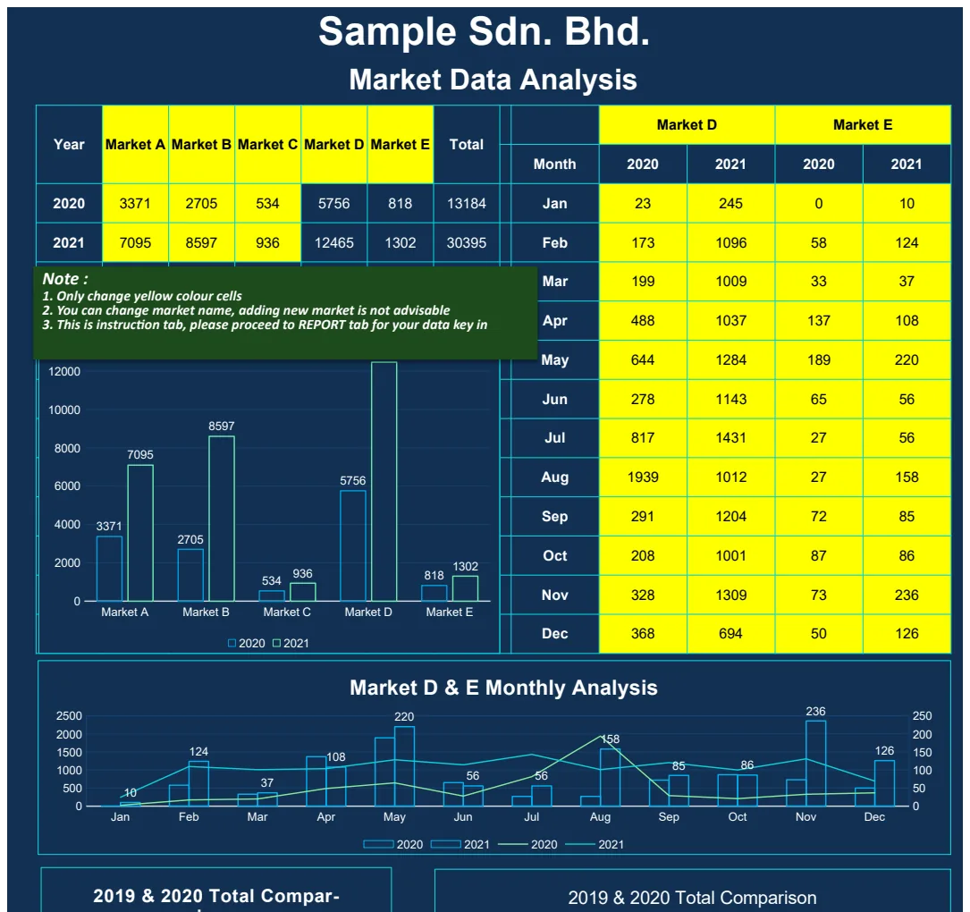
Market Data Analysis
Track and visualize market performance across multiple regions with year-over-year comparisons.
- Multi-market comparison columns
- Year-over-year data structure
- Pre-built charts and visualizations
 Data Analysis & Visualization
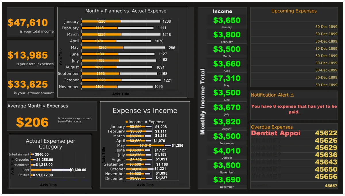
Monthly Budget Comparison: Planned vs. Actual Expenses & Income
A comprehensive budget tracking template with visualized bar charts comparing planned vs. actual monthly expenses and income across multiple categories.
- Automated SUM formulas for monthly totals
- Planned vs. Actual comparison charts
- Categorized expense and income trackers
 Data Analysis & Visualization
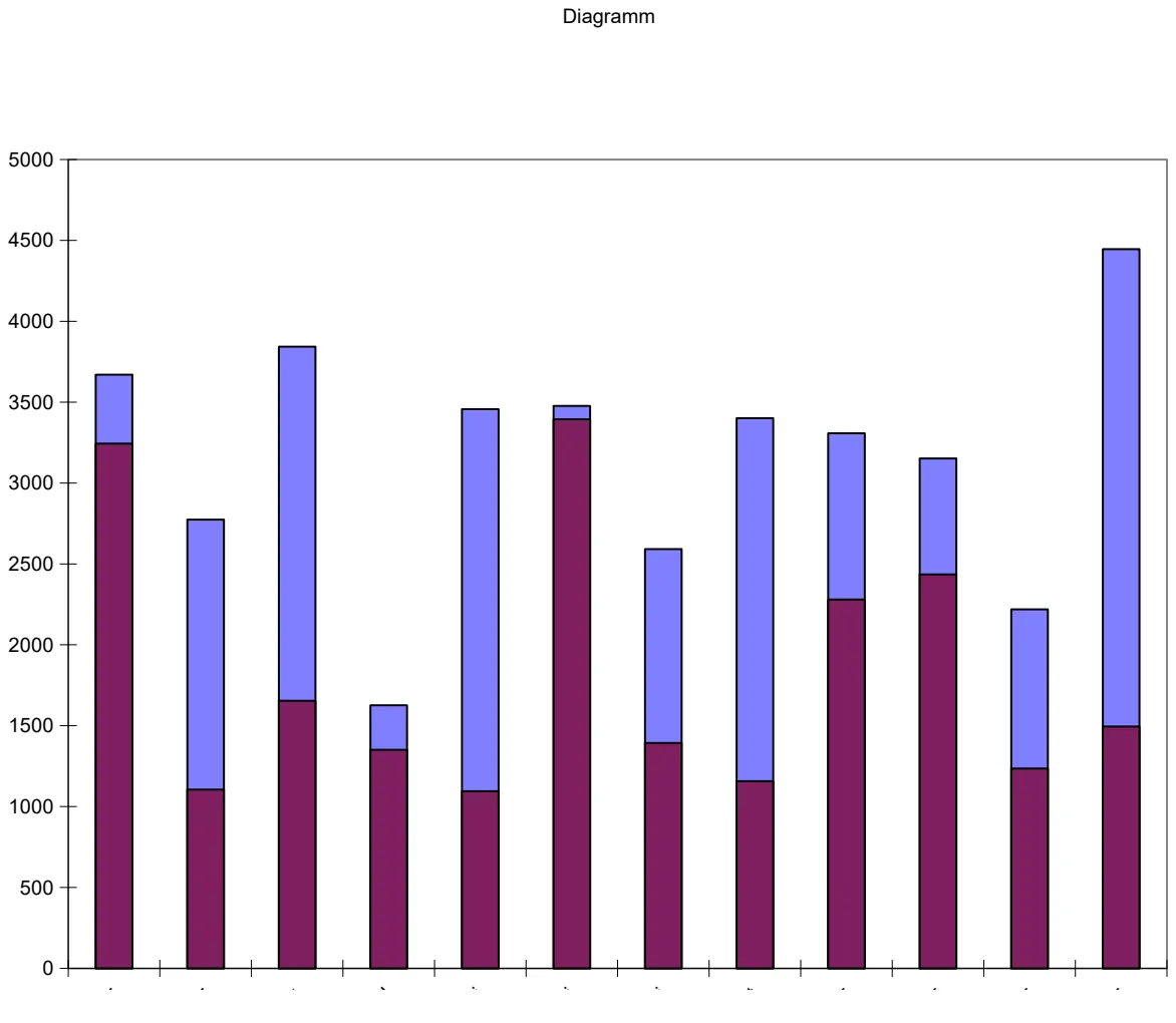
Monthly Call Volume Analysis Dashboard
Track daily maximum and minimum call volumes by month with visual performance charts.
- Monthly call volume data entry (max/min calls per day)
- Integrated charts visualizing daily call volume ranges
- Month-by-month performance tracking
 Data Analysis & Visualization
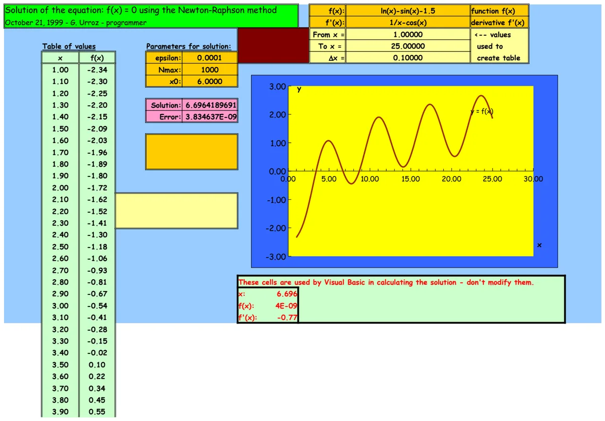
Newton-Raphson Equation Solver
Solve nonlinear equations f(x)=0 using the Newton-Raphson numerical method with iterative calculations.
- Automated Newton-Raphson iteration
- Convergence tracking and stopping criteria
- Function evaluation with trigonometric and logarithmic operations
 Data Analysis & Visualization
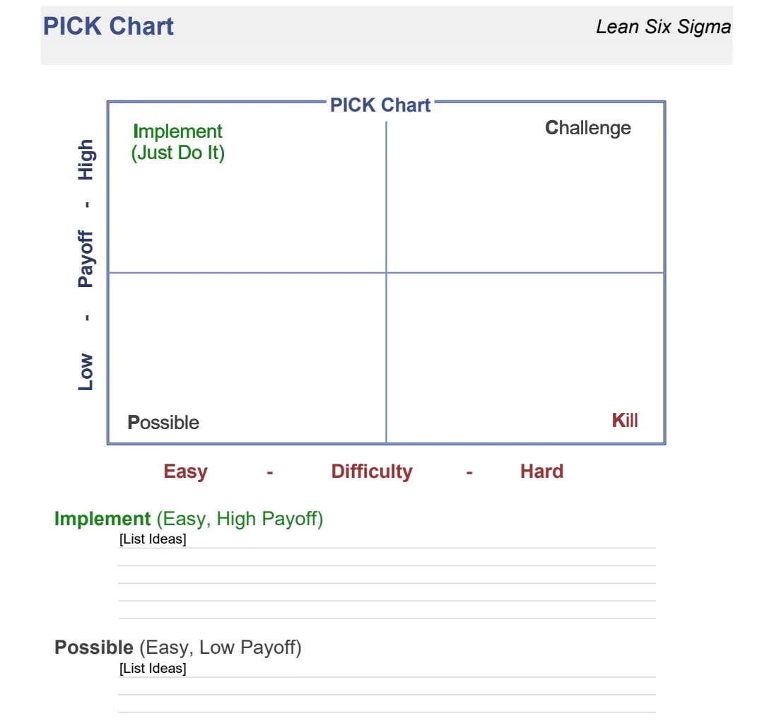
PICK Chart
Prioritize improvement projects using the PICK matrix method for Lean Six Sigma initiatives.
- 2x2 matrix visualization
- Payoff vs. Complexity axes
- Project plotting and categorization