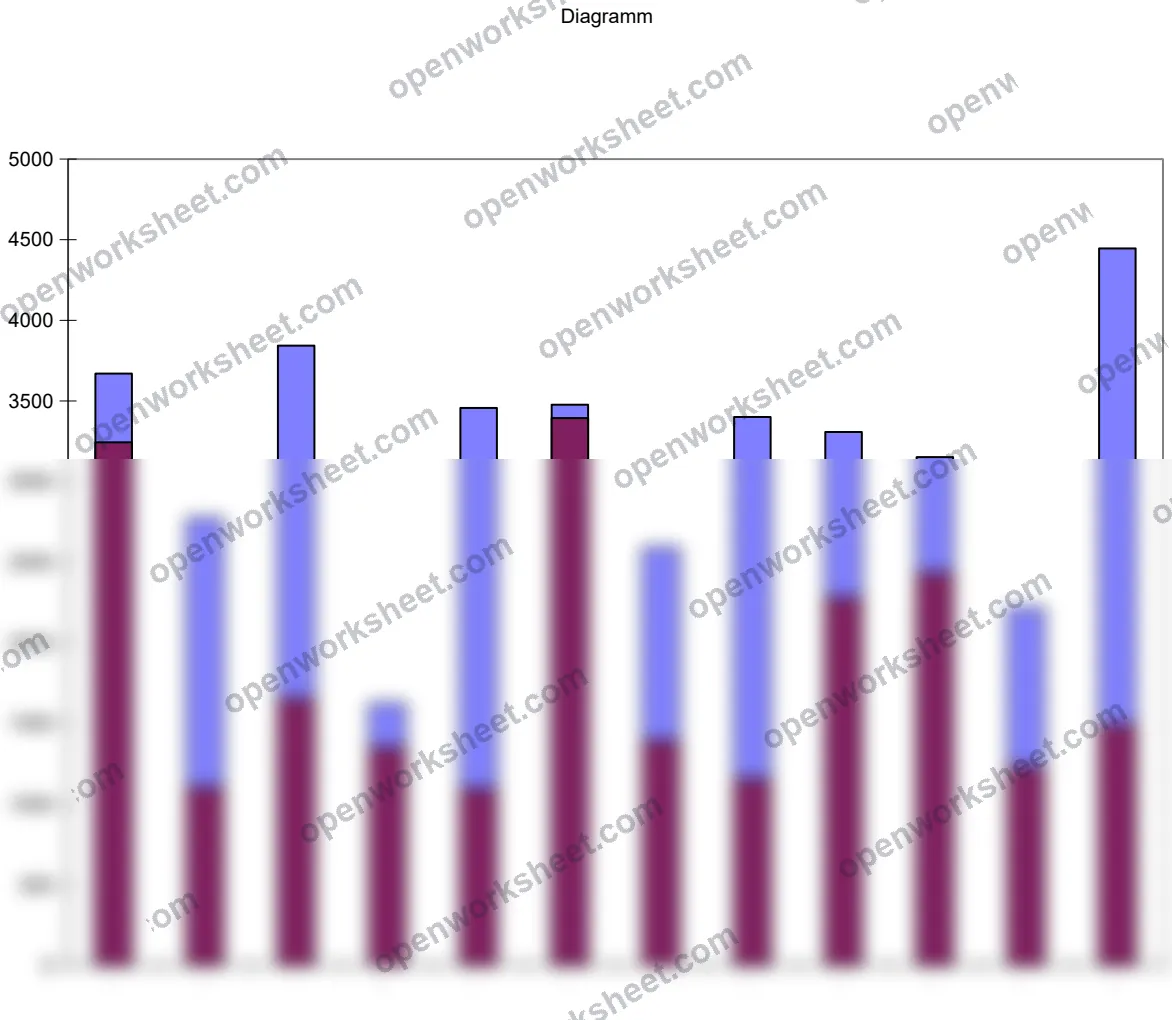
Monthly Call Volume Analysis Dashboard
Track daily maximum and minimum call volumes by month with visual performance charts.
This template helps you monitor call center or contact center performance by recording the highest and lowest call volumes for each month. The dashboard features integrated charts that visualize trends in call volume fluctuations, making it easy to spot seasonal patterns and capacity planning needs. Perfect for operations managers who need to understand staffing demands and peak periods throughout the year.
What's inside
- Monthly call volume data entry (max/min calls per day)
- Integrated charts visualizing daily call volume ranges
- Month-by-month performance tracking
- Trend analysis for operational planning
Download this and everything else
.xlsx · 2 sheets · includes charts
$29$9once for thousands of templates. No subscription.
- Limited-time offer, normally $29
- One payment, no subscription
- 14-day refund
More in Data Analysis & Visualization
 Data Analysis & Visualization
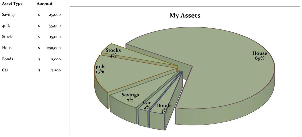
21st Century Asset Allocation Pie Chart
Visualize your net worth distribution across asset types with an interactive pie chart.
- Automatic pie chart generation
- Asset type and amount input fields
- Dynamic percentage calculations
 Data Analysis & Visualization
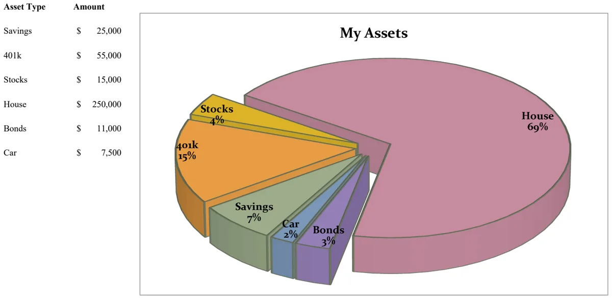
21st Century Pie Chart - Asset Breakdown
Visualize your asset allocation across savings, investments, and retirement accounts with an interactive pie chart.
- Pie chart visualization of asset distribution
- Asset type categorization
- Amount tracking by asset class
 Data Analysis & Visualization
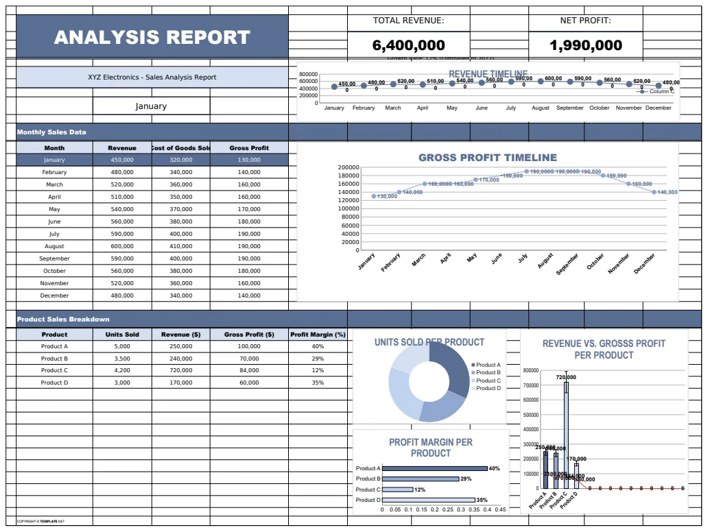
Analysis Report Template
A comprehensive analysis report template for tracking and visualizing business metrics like revenue and profit.
- Revenue tracking
- Profit calculation
- Error handling with IFERROR
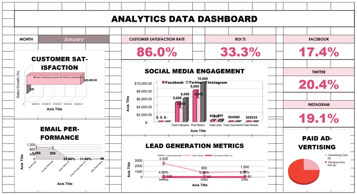 Data Analysis & Visualization
Analytics Data Dashboard
Comprehensive business analytics dashboard tracking customer satisfaction, sales performance, social media engagement, email campaigns, and lead generation metrics with interactive charts and KPI visualizations.
- Pre-built KPI calculations with formulas
- Multi-sheet analytics for different channels
- Social media engagement tracking