Category
Data Analysis & Visualization
Charts, diagrams, and statistical visuals for reporting data.
121 templates
 Data Analysis & Visualization
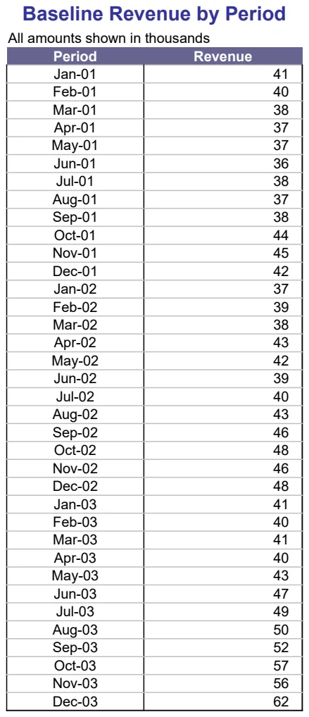
Revenue Trend Charting
Visualize revenue patterns with multiple trendline options to identify growth trajectories.
- Multiple trendline models (linear, logarithmic, polynomial, power)
- Revenue data organized by period
- Chart visualization of baseline revenue
 Data Analysis & Visualization
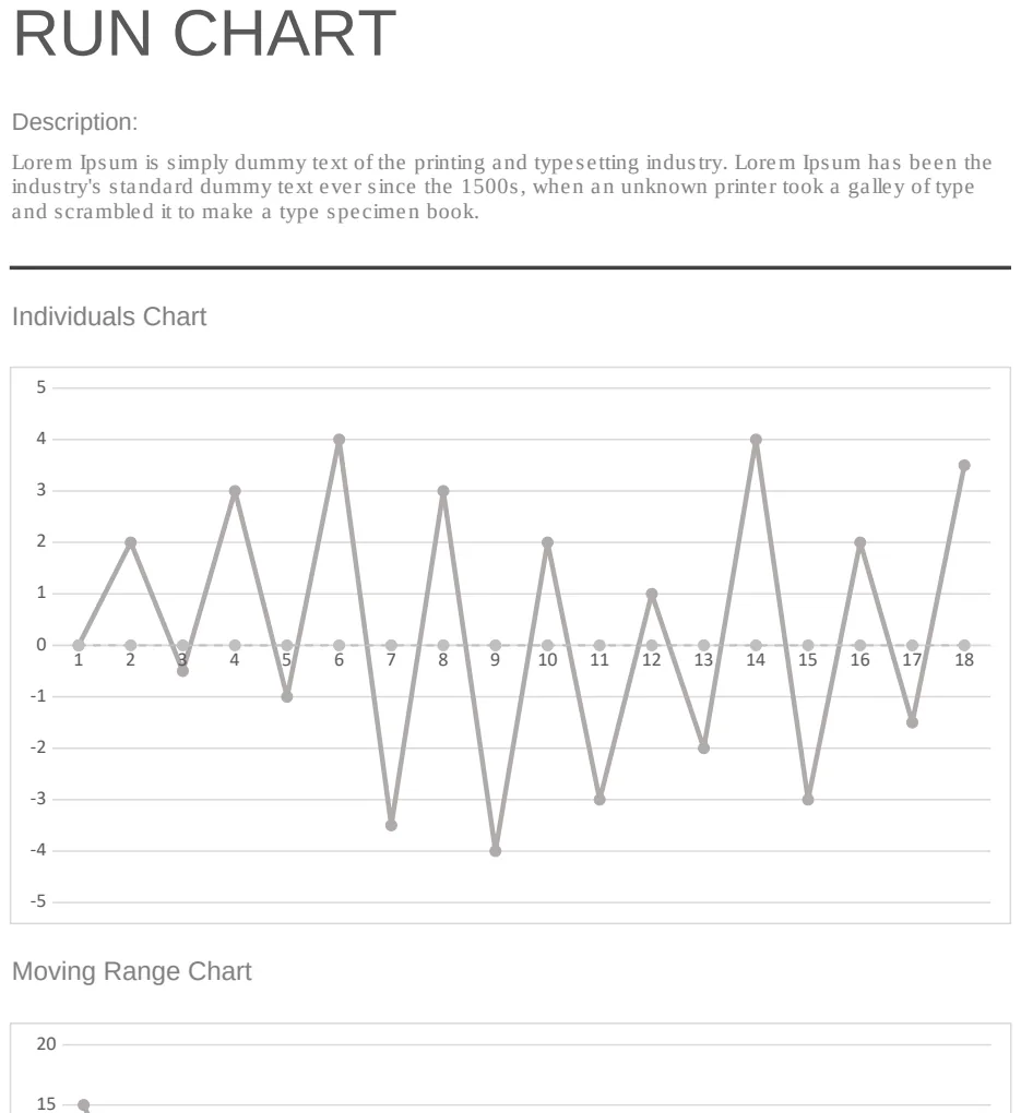
Run Chart
Track process performance over time with visual trend analysis and statistical control limits.
- Sequential data point plotting
- Trend line visualization
- Statistical control limits
 Data Analysis & Visualization
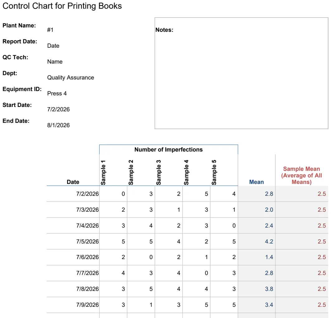
Run Chart for Manufacturing Quality Control
Track printing book quality metrics with run charts and control limits to detect process variations.
- Control chart with upper and lower control limits
- Sample data entry with plant identification
- Average calculations across measurement samples
 Data Analysis & Visualization
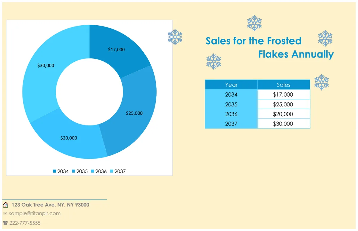
Sales Donut Chart
Visualize sales performance with an interactive donut chart that updates automatically from your data.
- Auto-updating donut chart
- Editable data ranges
- Professional chart formatting
 Data Analysis & Visualization
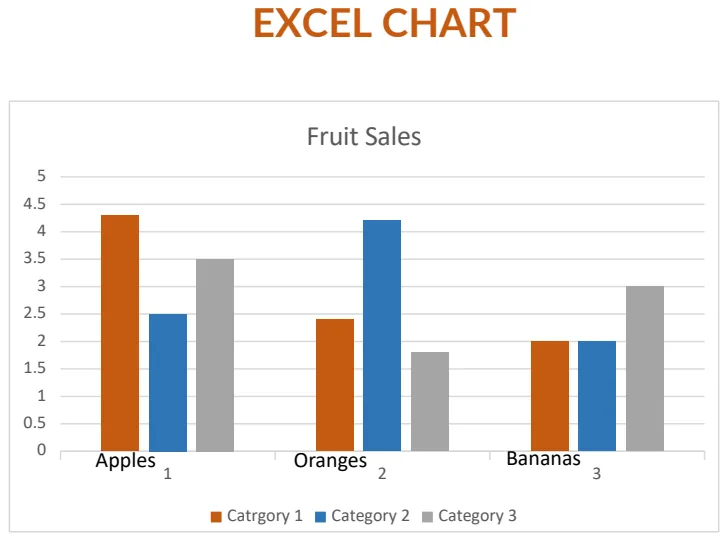
Sales Excel Chart Template
Visualize sales data with pre-built charts to track performance and trends at a glance.
- Pre-formatted Excel chart templates
- Multiple chart types for different data scenarios
- Easy data input and automatic chart updates
 Data Analysis & Visualization
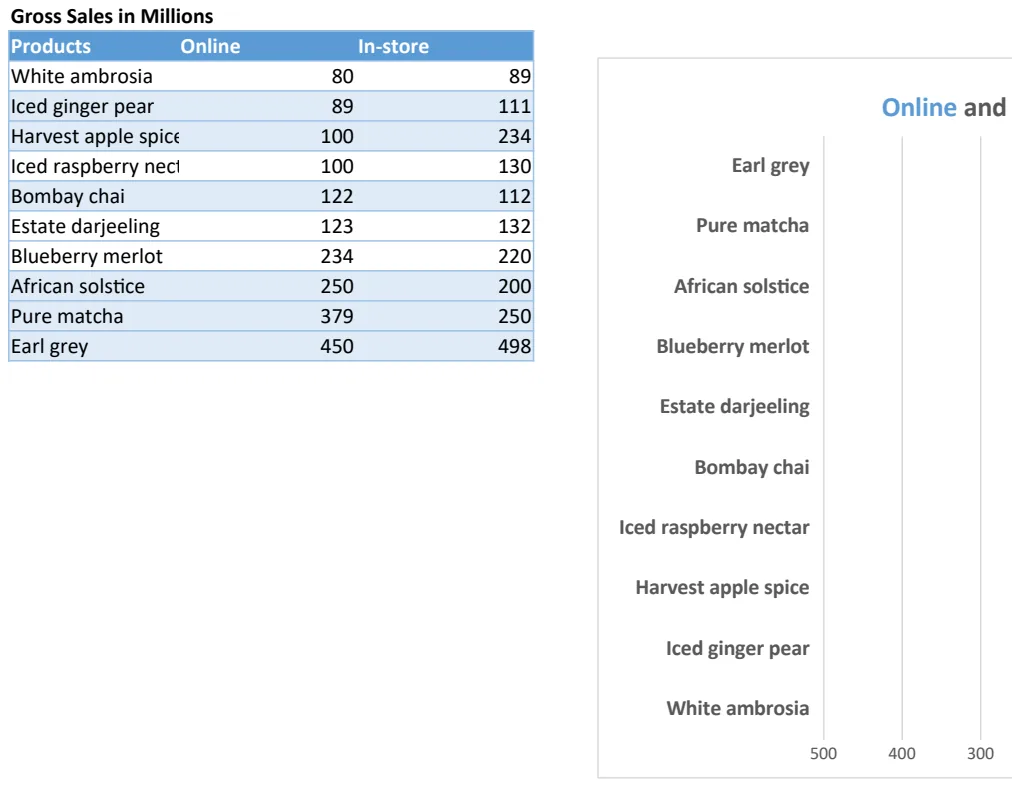
Sales Tornado Chart
Visualize sales performance across products and channels with an interactive tornado chart.
- Pre-formatted tornado chart structure
- Gross sales data by product and channel
- Online and in-store sales columns
 Data Analysis & Visualization
Sample Data Visualization Chart Template
Create professional charts from sample datasets with configurable data points and visual formatting.
- Pre-configured chart sheet
- Sample dataset with multiple data points
- Numerical values ready for visualization
 Data Analysis & Visualization
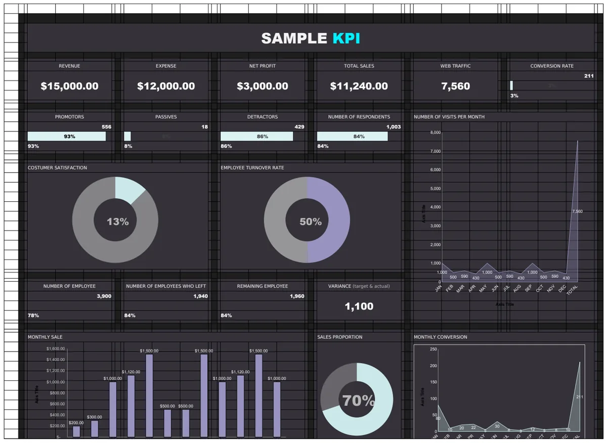
Sample KPI Template
A comprehensive KPI tracking template with revenue metrics, performance charts, and multi-sheet dashboard structure for monitoring key business indicators.
- Multi-sheet dashboard structure
- Revenue aggregation formulas
- Target vs actual comparison
 Data Analysis & Visualization
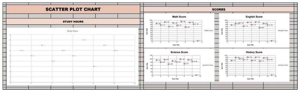
Scatter Plot Chart Template
A scatter plot chart template for visualizing the relationship between study hours and student performance across multiple subjects.
- Scatter plot visualization
- Sample student performance data
- Multi-subject scoring
 Data Analysis & Visualization
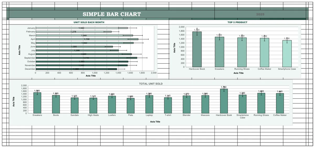
Simple Bar Chart Template
A template for creating bar charts to visualize unit sales data by month and product
- Dynamic bar charts
- Top 5 product ranking formulas
- Year-over-year data comparison
 Data Analysis & Visualization
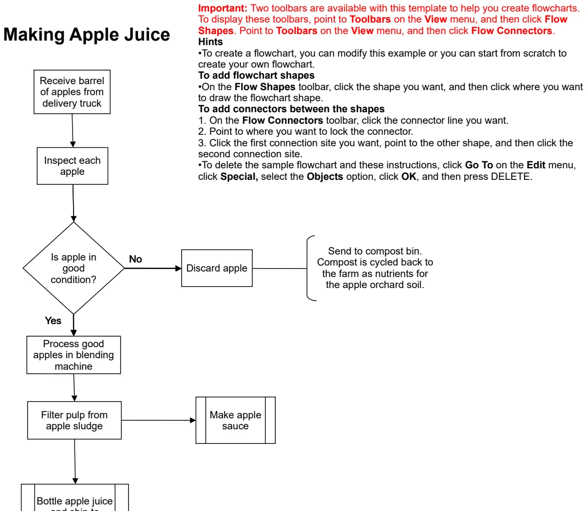
Simple Flowchart
Create visual process flows and decision diagrams to map workflows and business processes.
- Pre-designed flowchart shapes and connectors
- Easy-to-follow step-by-step layout
- Decision point indicators
 Data Analysis & Visualization
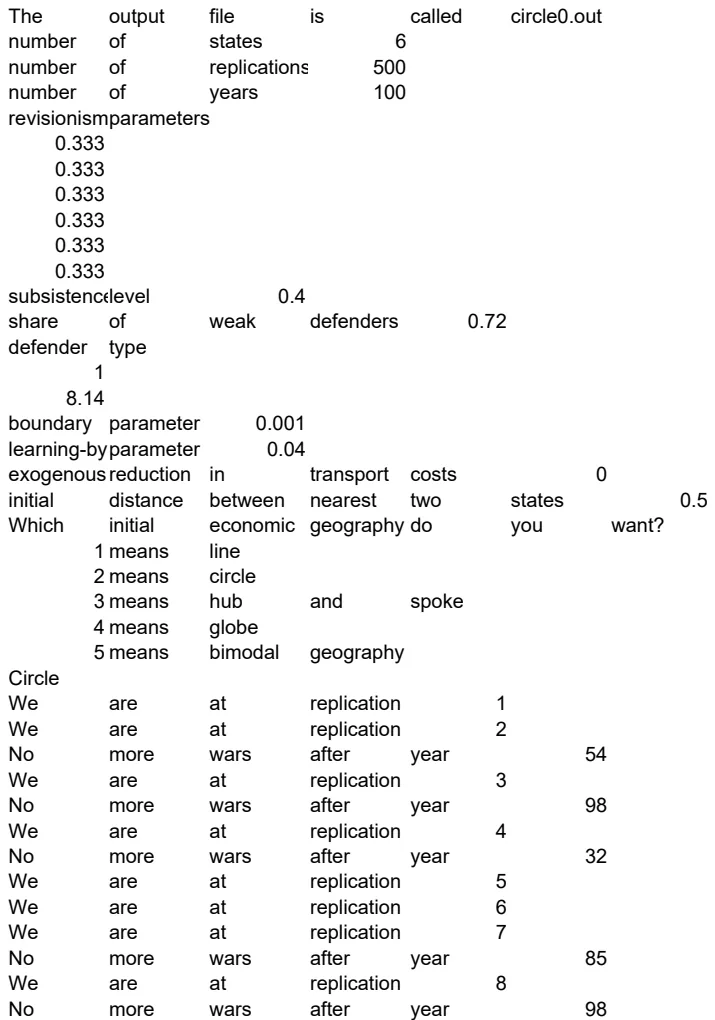
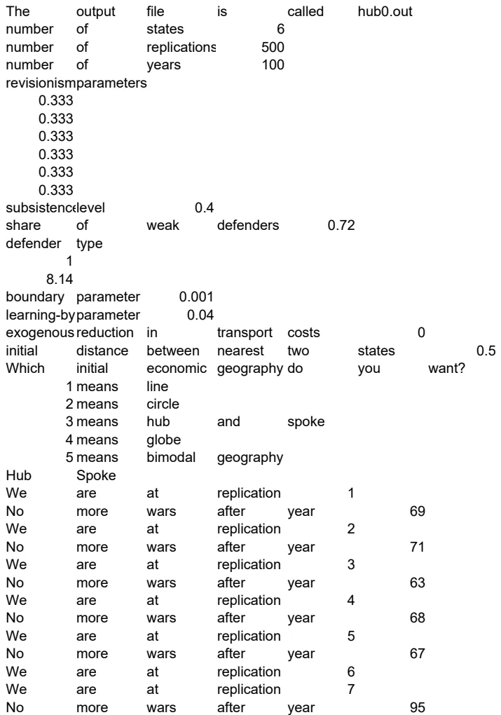
Simulation Output Analysis Template
Track and analyze simulation results with configurable states and replication counts.
- Configurable state and replication parameters
- Structured output file parsing
- Multi-run comparison capability
 Data Analysis & Visualization
Simulation Output Analyzer
Parse and aggregate simulation results with configurable states and replications.
- Parse delimited simulation outputs
- Automatic state aggregation
- Configurable replication counts
 Data Analysis & Visualization
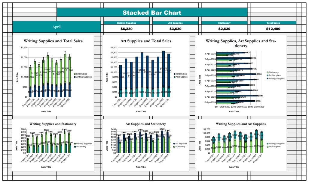
Stacked Bar Chart Template
A data visualization template using stacked bar charts to compare multiple product categories across different months.
- Stacked bar chart visualization
- Monthly data aggregation
- Category-based sales breakdown
 Data Analysis & Visualization
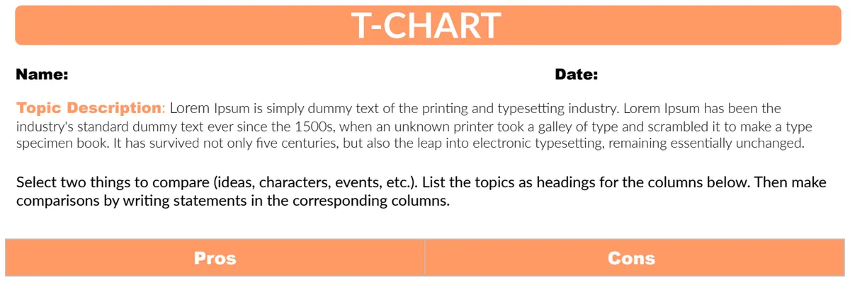
T Chart
Visually compare pros and cons side-by-side to evaluate decisions and analyze arguments objectively.
- Two-column layout for pros and cons
- Clean, simple structure
- Easy to fill in and share
 Data Analysis & Visualization
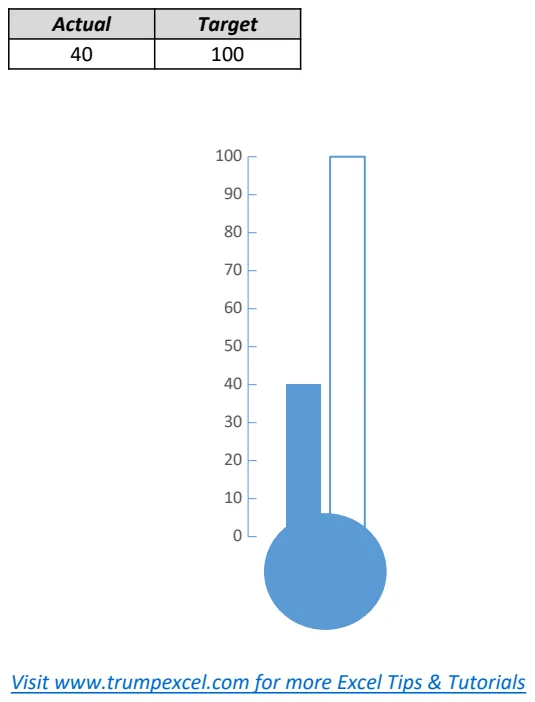
Thermometer Chart Example
Visual progress tracking chart that shows actual performance against target goals using a thermometer-style gauge display.
- Thermometer-style gauge visualization
- Actual vs. Target comparison
- Single metric focus
 Data Analysis & Visualization
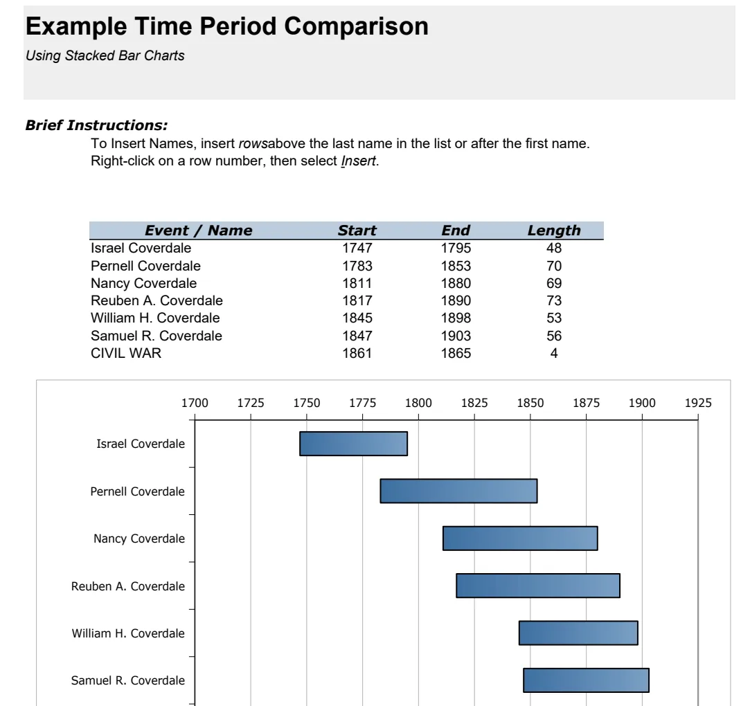
Timeline Bar Graph - Time Period Comparison
Visualize time period comparisons with stacked bar charts to identify trends across different intervals.
- Stacked bar chart format
- Multiple time period comparison
- Component-level breakdown visibility
 Data Analysis & Visualization
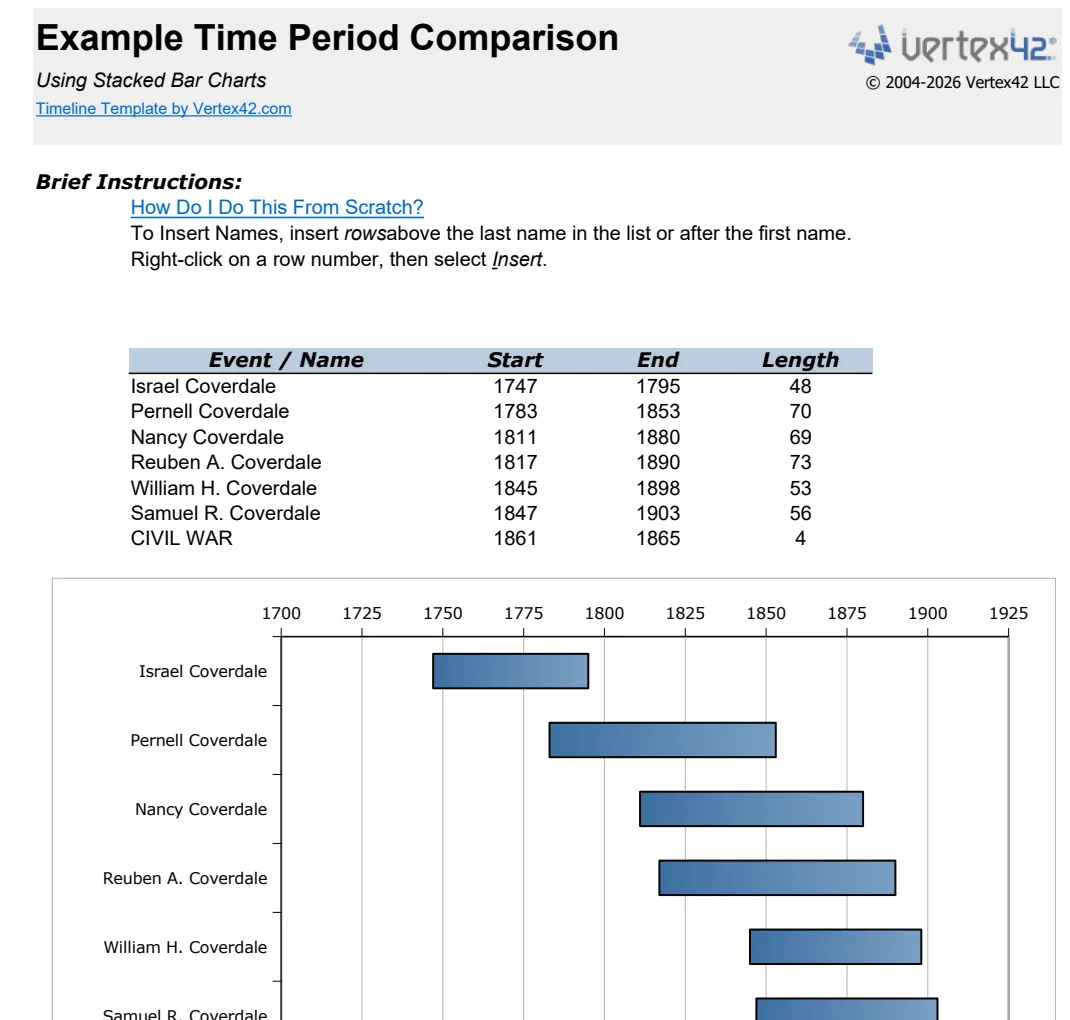
Timeline Bar Graph Template
Visualize time period comparisons with stacked bar charts for easy trend analysis and data comparison.
- Stacked bar chart for multi-period comparison
- Dynamic date references using TODAY() and YEAR()
- Customizable data input for flexible time periods
 Data Analysis & Visualization
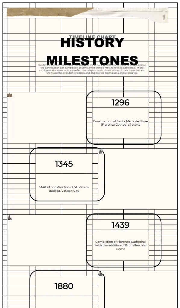
Timeline Chart Template
A timeline chart template for visualizing historical milestones and significant events in chronological order.
- Automatic timeline chart generation from data
- Year and description columns for milestone tracking
- Dynamic chart updates based on data input
 Data Analysis & Visualization
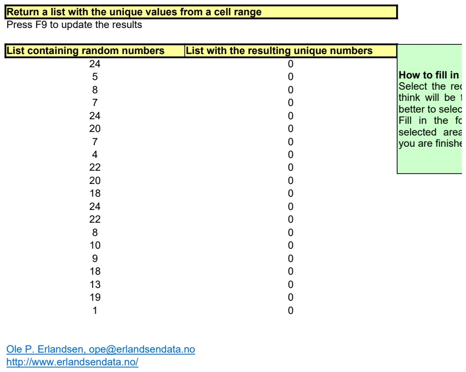
Unique Values Extractor
Extract and list all unique values from a cell range with automatic updates.
- Automatic unique value extraction from specified range
- F9 refresh function for real-time updates
- Formula-driven approach with no manual intervention needed
 Data Analysis & Visualization
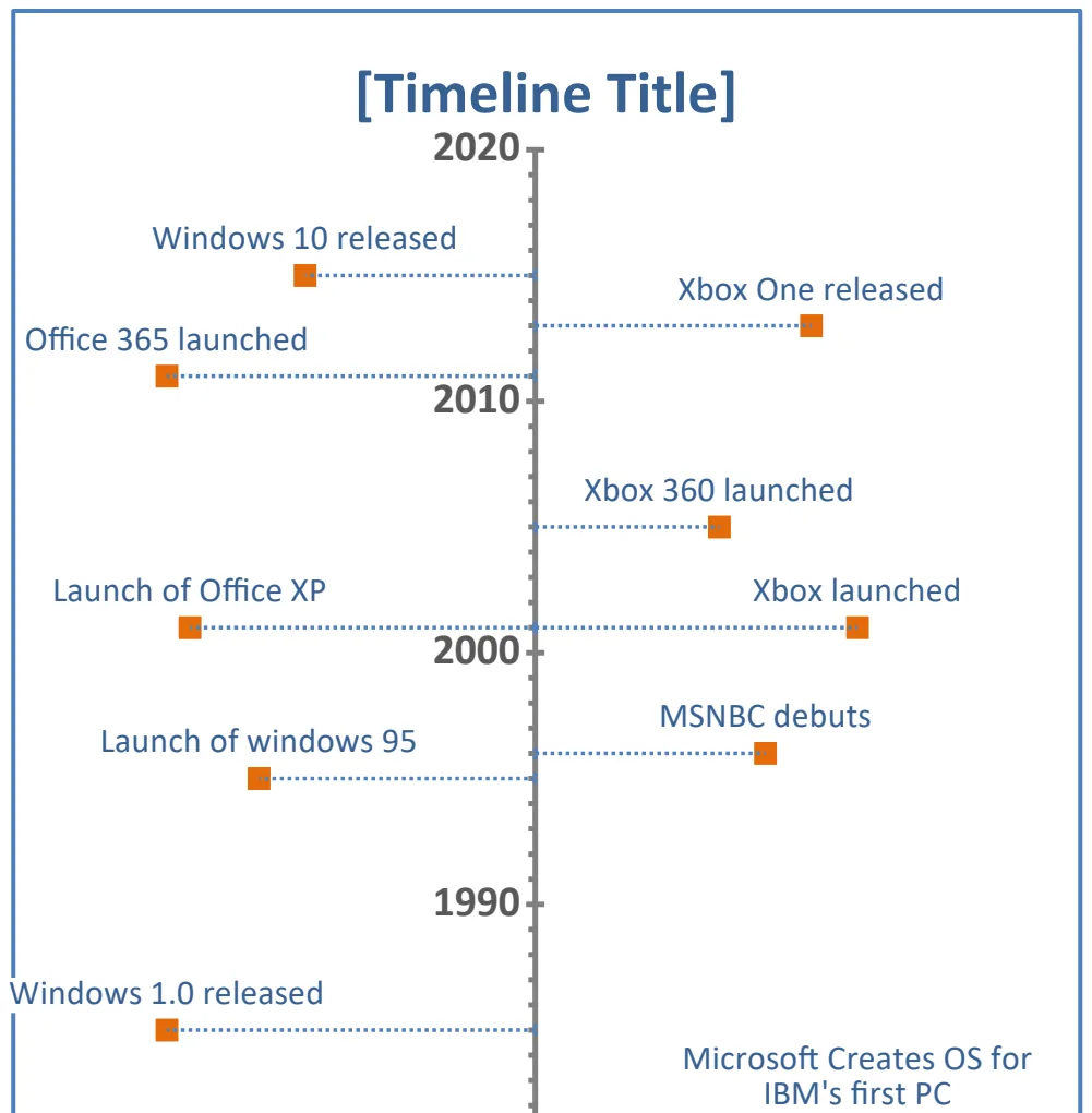
Vertical Timeline Chart
Create visual timelines with events positioned vertically by year and custom labels.
- Year-based event positioning
- Custom event labels
- Vertical chart layout
 Data Analysis & Visualization
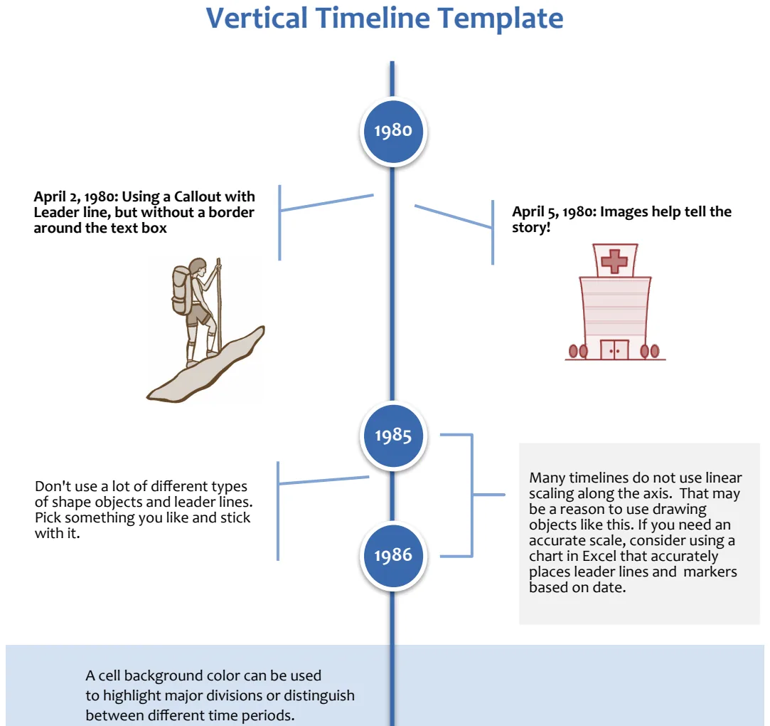
Vertical Timeline with Shapes
Create professional vertical timelines using Excel shapes to visualize project milestones and events chronologically.
- Shape-based vertical timeline layout
- Customizable event markers and labels
- Chronological milestone positioning
 Data Analysis & Visualization
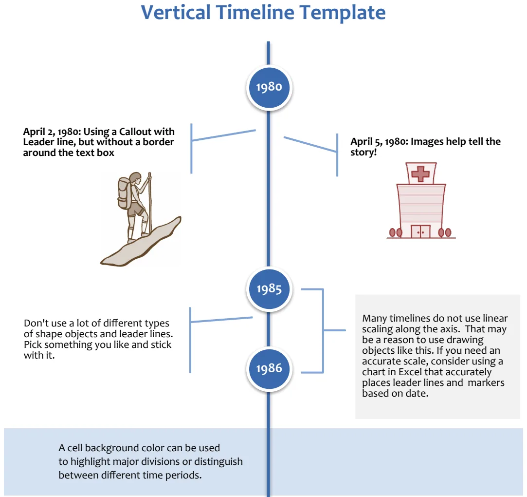
Vertical Timeline with Shapes
Create professional vertical timelines with shapes to visualize events, milestones, and project phases chronologically.
- Pre-designed vertical timeline layout
- Editable shapes for milestones
- Date and description fields
 Data Analysis & Visualization
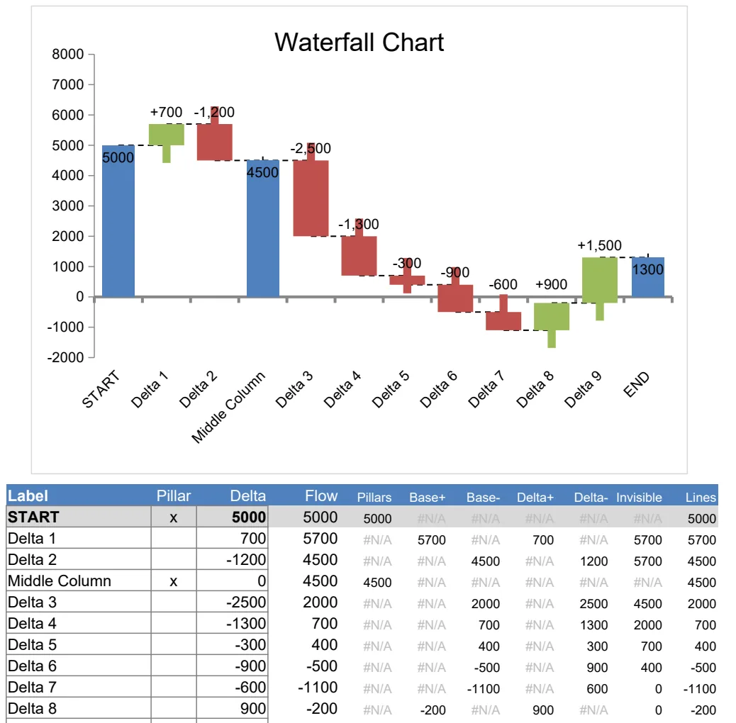
Waterfall Chart Template
Visualize financial changes and cumulative impact with interactive waterfall charts.
- Pre-built waterfall chart structure
- Automatic formula calculations with ABS, IF, OFFSET
- Multiple example scenarios included