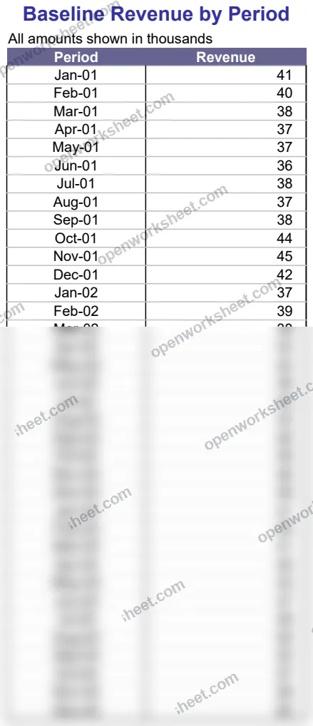
Revenue Trend Charting
Visualize revenue patterns with multiple trendline options to identify growth trajectories.
This template helps you track baseline revenue by period and overlay different mathematical trendlines—linear, logarithmic, polynomial, and power—to reveal underlying growth patterns. Use it to compare which trend best fits your revenue data and forecast future performance with confidence. Ideal for finance teams, investors, and business analysts who need to communicate revenue momentum clearly.
What's inside
- Multiple trendline models (linear, logarithmic, polynomial, power)
- Revenue data organized by period
- Chart visualization of baseline revenue
- Comparative analysis across trend models
Download this and everything else
.xlsx · 7 sheets · includes charts
$29$9once for thousands of templates. No subscription.
- Limited-time offer, normally $29
- One payment, no subscription
- 14-day refund
More in Data Analysis & Visualization
 Data Analysis & Visualization
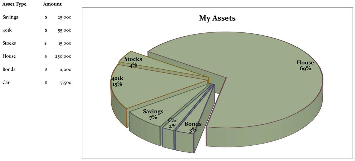
21st Century Asset Allocation Pie Chart
Visualize your net worth distribution across asset types with an interactive pie chart.
- Automatic pie chart generation
- Asset type and amount input fields
- Dynamic percentage calculations
 Data Analysis & Visualization
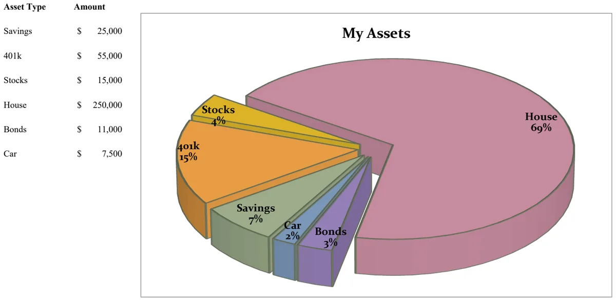
21st Century Pie Chart - Asset Breakdown
Visualize your asset allocation across savings, investments, and retirement accounts with an interactive pie chart.
- Pie chart visualization of asset distribution
- Asset type categorization
- Amount tracking by asset class
 Data Analysis & Visualization
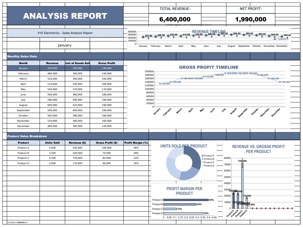
Analysis Report Template
A comprehensive analysis report template for tracking and visualizing business metrics like revenue and profit.
- Revenue tracking
- Profit calculation
- Error handling with IFERROR
 Data Analysis & Visualization
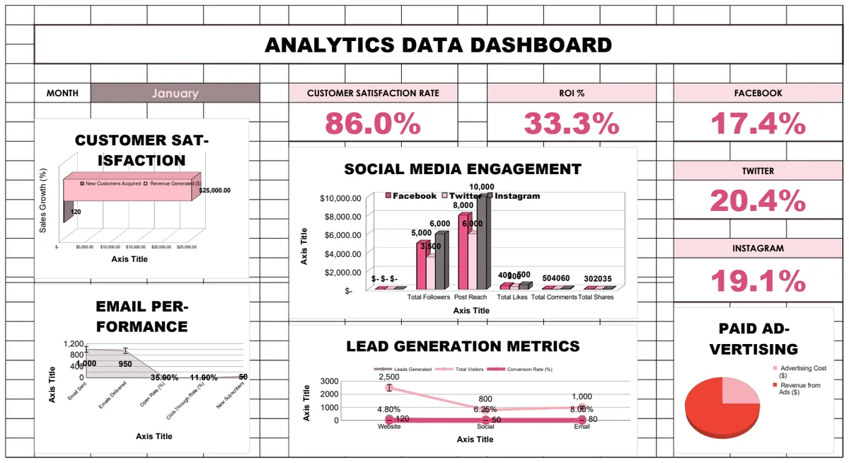
Analytics Data Dashboard
Comprehensive business analytics dashboard tracking customer satisfaction, sales performance, social media engagement, email campaigns, and lead generation metrics with interactive charts and KPI visualizations.
- Pre-built KPI calculations with formulas
- Multi-sheet analytics for different channels
- Social media engagement tracking