21st Century Asset Allocation Pie Chart
Visualize your net worth distribution across asset types with an interactive pie chart.
This template displays your total assets broken down by category using a dynamic pie chart. Simply enter your asset types and amounts, and watch the chart automatically update to show proportional allocation. Perfect for anyone wanting to see at a glance where their wealth is concentrated—whether in savings, retirement accounts, real estate, or investments.
What's inside
- Automatic pie chart generation
- Asset type and amount input fields
- Dynamic percentage calculations
- Color-coded asset categories
Download this and everything else
.xlsx · 1 sheet · includes charts
$29$9once for thousands of templates. No subscription.
- Limited-time offer, normally $29
- One payment, no subscription
- 14-day refund
More in Data Analysis & Visualization
 Data Analysis & Visualization
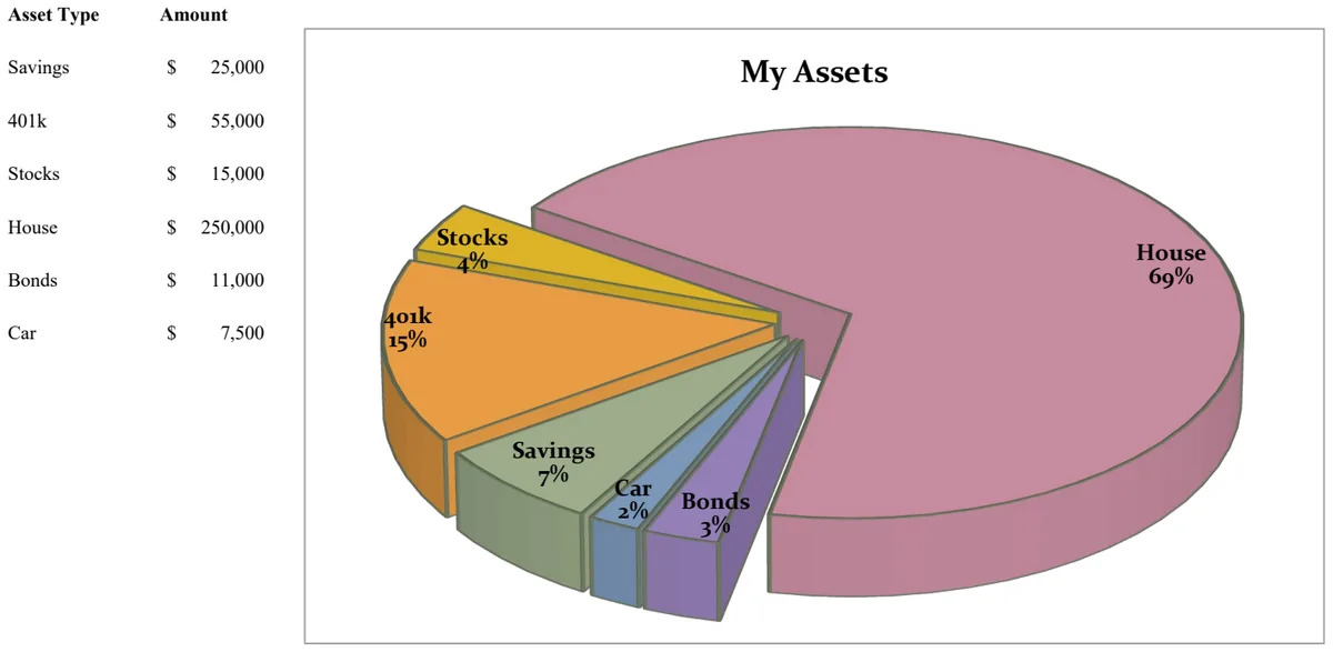
21st Century Pie Chart - Asset Breakdown
Visualize your asset allocation across savings, investments, and retirement accounts with an interactive pie chart.
- Pie chart visualization of asset distribution
- Asset type categorization
- Amount tracking by asset class
 Data Analysis & Visualization
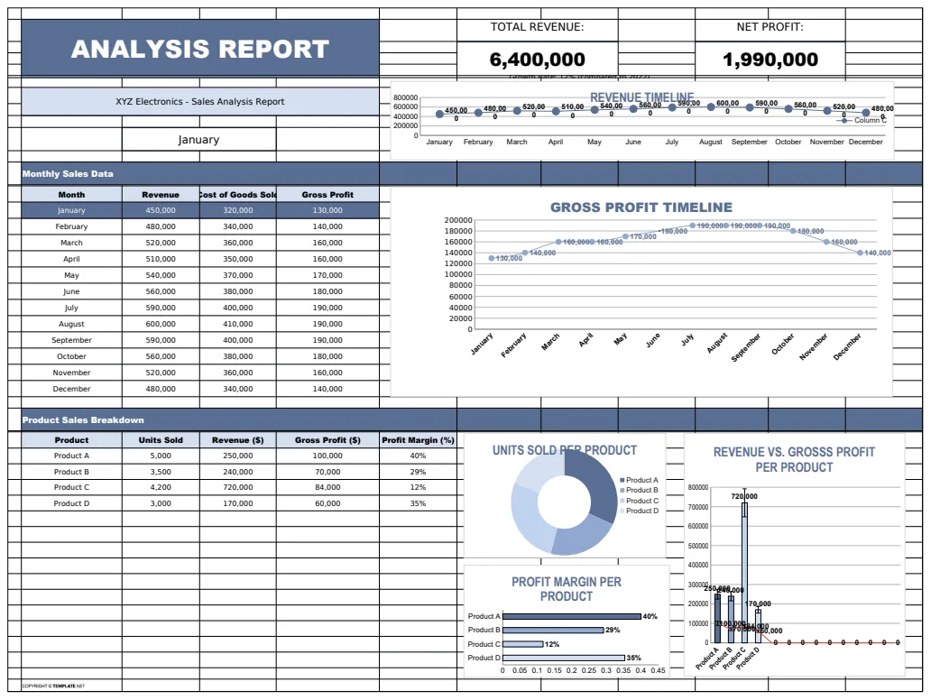
Analysis Report Template
A comprehensive analysis report template for tracking and visualizing business metrics like revenue and profit.
- Revenue tracking
- Profit calculation
- Error handling with IFERROR
 Data Analysis & Visualization
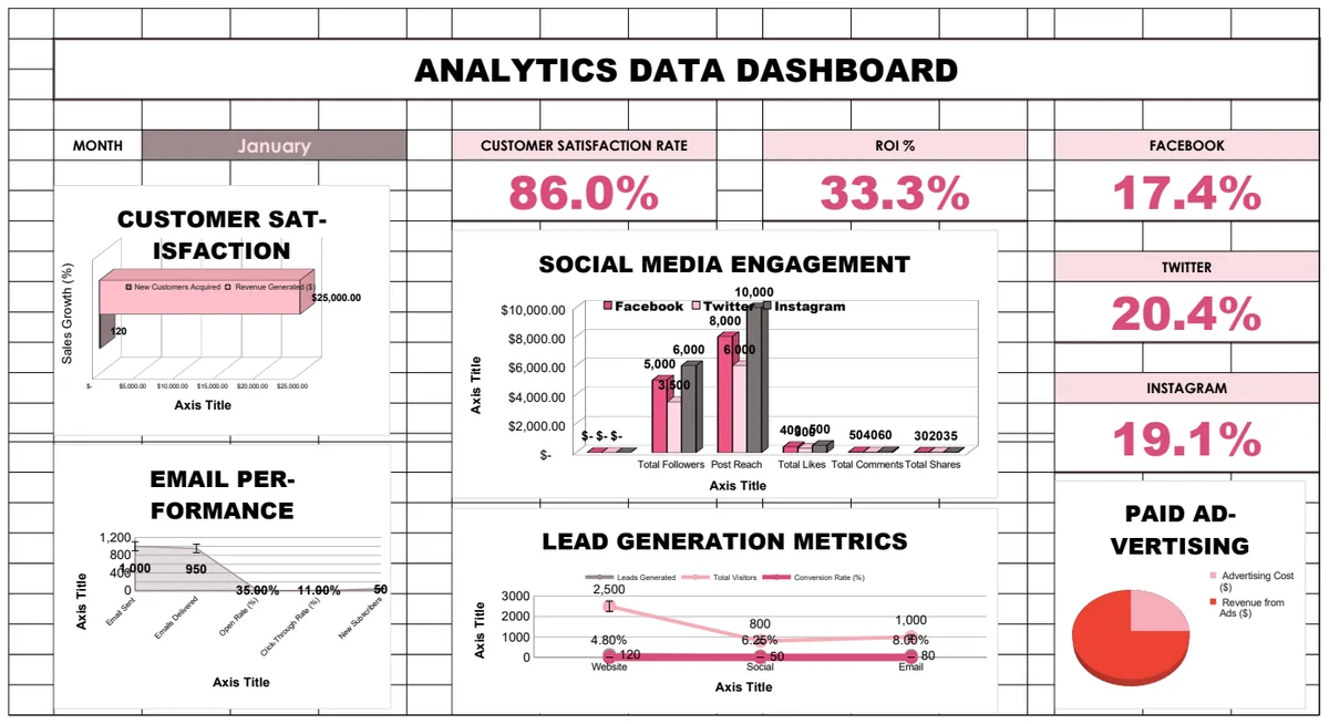
Analytics Data Dashboard
Comprehensive business analytics dashboard tracking customer satisfaction, sales performance, social media engagement, email campaigns, and lead generation metrics with interactive charts and KPI visualizations.
- Pre-built KPI calculations with formulas
- Multi-sheet analytics for different channels
- Social media engagement tracking
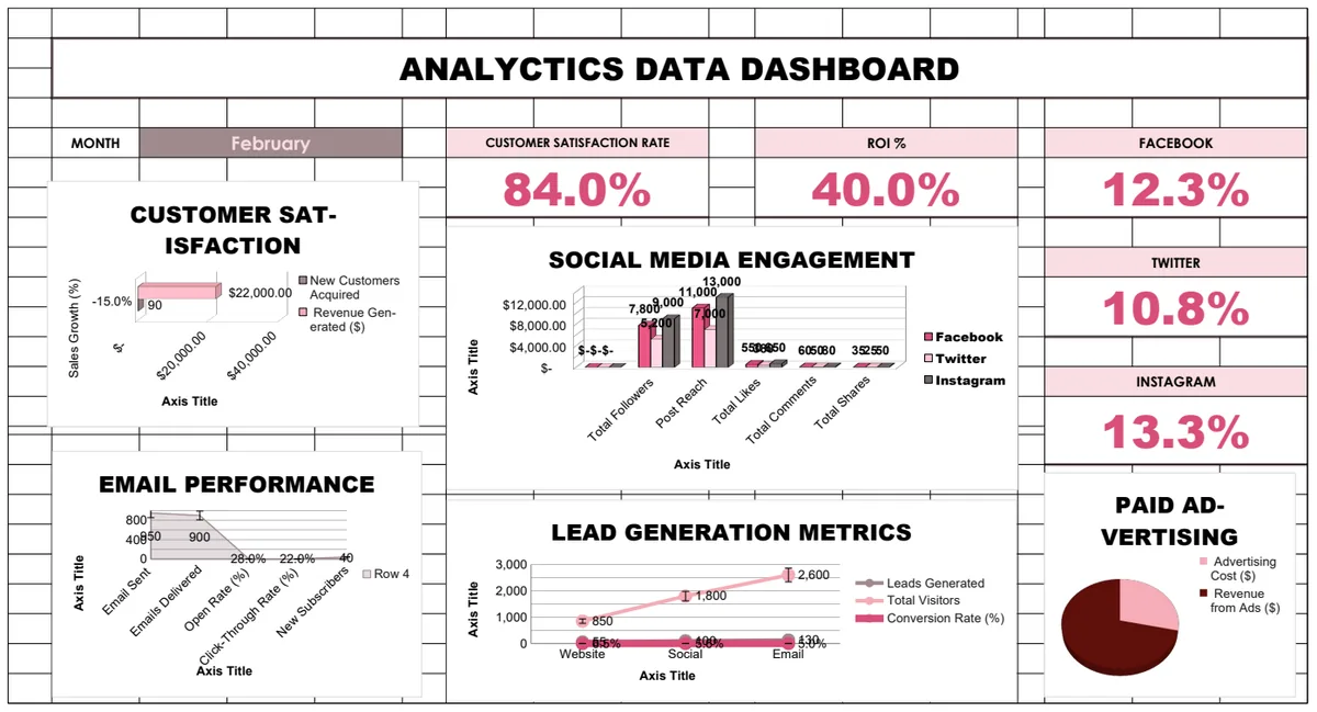 Data Analysis & Visualization
Analytics Data Dashboard
Comprehensive multi-sheet analytics dashboard tracking customer satisfaction, sales performance, social media engagement, email campaigns, and lead generation metrics with automated calculations and visualizations.
- Multi-sheet organization by metric type
- Automated calculations using formulas
- Customer satisfaction tracking