Best Business Dashboards in Excel (2026 Guide)
Business dashboards in Excel turn raw numbers into decisions. A dashboard is a visual representation of key metrics that allows you to quickly view and analyze your data in one place. In 2026, Excel's...

Business dashboards in Excel turn raw numbers into decisions. A dashboard is a visual representation of key metrics that allows you to quickly view and analyze your data in one place. In 2026, Excel's automation features eliminate the manual grunt work that has always slowed dashboard workflows down, making it faster to build, update, and share dashboards across teams.
Excel now handles real-time data refresh, natural-language automation, and dynamic pivot tables without macros or VBA. These updates matter for founders tracking monthly revenue, finance teams monitoring cash flow, and operations managers watching inventory levels. You can build a functional dashboard in an afternoon and maintain it in minutes per week instead of hours.
How Excel's 2026 Automation Features Transform Dashboard Workflows
Excel's 2026 release introduced two features that cut dashboard maintenance time: auto-refreshing SPILL Pivot Tables and Copilot Agent Mode for natural-language commands. Both remove the copy-paste loops and manual refresh cycles that made older dashboards fragile.
SPILL Pivot Tables expand and contract automatically as your source data changes. Copilot Agent Mode lets you type plain-English instructions to clean data, generate charts, and update formulas. Together, they turn a static spreadsheet into a live dashboard that updates itself.
Auto-Refreshing SPILL Pivot Tables: Setup and Use Cases
Pivot tables now support SPILL behavior and auto-refresh. Results expand dynamically as the underlying data changes, and the pivot table updates automatically without requiring a manual refresh. This means your sales summary, expense breakdown, or inventory report stays current without clicking "Refresh All" every morning.
To set up a SPILL Pivot Table, convert your source data to an Excel Table (Ctrl+T), then insert a pivot table as usual. In the pivot table options, enable "Auto-refresh on open" and check "Expand output range." When you add new rows to the source table, the pivot table grows to include them and recalculates totals instantly.
Use cases include monthly sales dashboards that pull from a running order log, expense trackers that summarize transactions by category, and inventory reports that flag low-stock items. The auto-refresh eliminates version control headaches when multiple team members add data throughout the day.
Using Copilot Agent Mode to Automate Data Prep and Chart Updates
Copilot Agent Mode accepts natural-language commands like "Remove duplicate orders and calculate total revenue by region" or "Create a line chart showing monthly sales for the last six months." Excel interprets the request, writes the formulas or builds the chart, and applies the changes to your active sheet.
This speeds up repetitive tasks. Instead of writing a nested SUMIFS formula to calculate quarterly revenue by product category, type "Sum revenue by category for Q1 2026" and Copilot generates the formula. Instead of manually formatting a chart, ask "Format this chart with blue bars and data labels" and Copilot applies the style.
Practical examples: cleaning imported CSV files by removing blank rows and standardizing date formats, generating a pivot chart from a sales table without opening the pivot table wizard, and updating dashboard KPIs by typing "Recalculate conversion rate using updated lead count." These commands work best when your data lives in structured Excel Tables with clear column headers.
Step-by-Step Guide: Building an Interactive Business Dashboard in Excel
Building a dashboard from scratch takes five steps: define metrics, structure data tables, write formulas, add visuals, and arrange the layout. Each step builds on the previous one, so skipping ahead creates errors that waste time later.
Start with a blank workbook and one clear goal: what decision does this dashboard support? A sales dashboard helps you allocate budget to top-performing channels. A finance dashboard shows whether you can afford a new hire. A marketing dashboard reveals which campaigns generate qualified leads. Define the goal before choosing metrics.
Step 1: Define Your Key Metrics and Data Sources
Identify three to seven KPIs that directly inform your goal. For a sales dashboard, track monthly revenue, average deal size, win rate, and sales cycle length. For a finance dashboard, monitor cash balance, monthly burn rate, and runway in months. For a marketing dashboard, measure cost per lead, conversion rate by channel, and return on ad spend.
List the data sources for each metric. Revenue comes from your CRM export or order log. Cash balance comes from your accounting software or bank statements. Cost per lead requires ad spend data and lead counts from your marketing platform. If a data source updates weekly, plan to refresh your dashboard weekly. If it updates daily, use Power Query or a direct connection to keep the dashboard current.
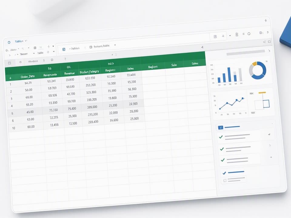
Structure each data source as an Excel Table with consistent column names. Use "Order_Date," "Revenue," "Product_Category," and "Region" instead of "Date," "Sales," "Type," and "Location." Consistent naming makes formulas easier to write and debug.
Step 2: Set Up Dynamic Data Tables and Named Ranges
Convert every data source to an Excel Table by selecting the range and pressing Ctrl+T. Excel Tables automatically expand when you add rows, so formulas that reference the table always include new data. This eliminates the need to update cell ranges in formulas every time your data grows.
Name your tables descriptively: "Sales_Data," "Expense_Log," "Inventory_List." Use the Table Design tab to set the table name. Then create named ranges for key values that appear in multiple formulas. For example, name cell B2 "Current_Month" if it holds the month you're analyzing, or name cell C2 "Target_Revenue" if it holds your monthly goal.
Named ranges make formulas readable. Instead of =SUMIFS(G:G,A:A,">=1/1/2026",A:A,"<=1/31/2026"), write =SUMIFS(Sales_Data[Revenue],Sales_Data[Order_Date],">="&Current_Month,Sales_Data[Order_Date],"<="&EOMONTH(Current_Month,0)). The second version updates automatically when you change the Current_Month cell.
Step 3: Build Core Calculations with Formulas (SUMIFS, XLOOKUP, LET)
Dashboard metrics require summary formulas that aggregate, filter, and compare data. SUMIFS calculates totals with multiple conditions. XLOOKUP retrieves values from lookup tables. LET assigns names to intermediate calculations, making complex formulas easier to debug.
Example: Calculate monthly revenue by region. Use =SUMIFS(Sales_Data[Revenue],Sales_Data[Region],"West",Sales_Data[Order_Date],">="&Current_Month,Sales_Data[Order_Date],"<="&EOMONTH(Current_Month,0)). This sums revenue where region equals "West" and order date falls in the current month.
Example: Calculate conversion rate. Use =LET(leads,COUNTIFS(Lead_Data[Status],"New",Lead_Data[Month],Current_Month),conversions,COUNTIFS(Lead_Data[Status],"Converted",Lead_Data[Month],Current_Month),conversions/leads). LET defines "leads" and "conversions" as intermediate values, then divides them to produce the rate. This approach prevents errors when you reuse the same COUNTIFS logic in multiple places.
Example: Look up target revenue for a specific product. Use =XLOOKUP(B5,Target_Table[Product],Target_Table[Revenue],"Not Found"). XLOOKUP searches the Product column in Target_Table, returns the matching Revenue value, and displays "Not Found" if the product doesn't exist.
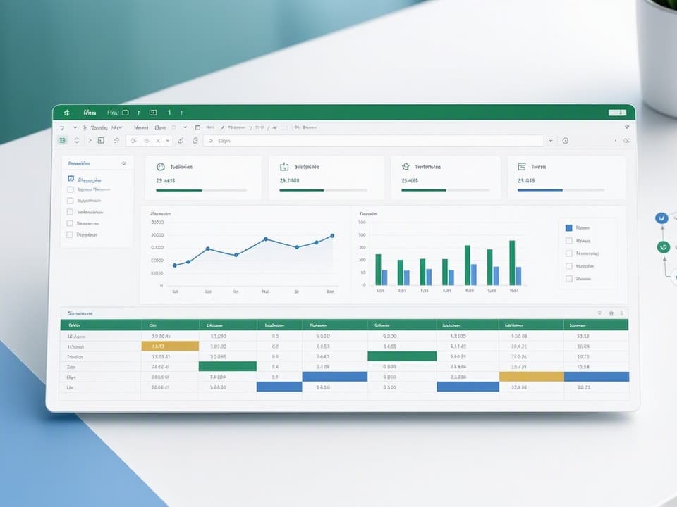
Step 4: Design Visual Elements (Charts, Slicers, Conditional Formatting)
Choose chart types that match your data. Use column charts for comparing categories (revenue by region, expenses by department). Use line charts for trends over time (monthly sales, daily website traffic). Use pie charts sparingly, only when showing parts of a whole with fewer than five categories. Use sparklines for compact trend indicators inside table cells.
Add slicers to filter your dashboard interactively. Insert a slicer by selecting your pivot table or Excel Table, then clicking Insert > Slicer. Choose dimensions like "Region," "Product_Category," or "Month." When a user clicks a slicer button, all connected charts and tables update to show only the selected subset.
Apply conditional formatting to highlight outliers and trends. Use color scales to shade cells from red (low) to green (high) for metrics like sales performance or inventory turnover. Use icon sets (arrows, traffic lights) to flag KPIs that are above target, on target, or below target. Use data bars to show relative size inside cells, making it easy to compare values at a glance.
Step 5: Arrange Layout for Clarity and Mobile-Friendly Viewing
Organize your dashboard in a grid with clear sections. Place the most important KPIs in the top-left corner where eyes land first. Group related metrics together: all sales metrics in one section, all finance metrics in another. Use white space between sections to prevent visual clutter.
Test readability on a laptop screen at 100% zoom. If you need to scroll horizontally or squint to read labels, the layout is too dense. Reduce the number of charts, increase font sizes, or split the dashboard into multiple sheets. Use the Page Layout view to see how the dashboard prints, then adjust column widths and row heights so everything fits on one or two pages.
For mobile viewing, avoid charts smaller than 3 inches wide. Use larger fonts (12pt minimum) for labels and titles. Test the dashboard on a tablet or phone using Excel Online to ensure slicers and buttons remain clickable.
Six Essential Business Dashboard Types and What to Track in Each
Different business functions need different dashboards. Sales teams track pipeline and revenue. Marketing teams track campaign performance and lead quality. Finance teams track cash flow and budget variance. Each dashboard type focuses on metrics that drive specific decisions.
The examples below include the metrics to track, the formulas to calculate them, and layout tips for each dashboard type. Use these as starting points, then customize based on your business model and reporting needs.
Sales Dashboard: Revenue, Pipeline, and Conversion Metrics
Track monthly revenue, average deal size, win rate, sales cycle length, and pipeline value by stage. Use a column chart to show revenue by month, a funnel chart to visualize pipeline stages, and a table to list top-performing sales reps.
Calculate monthly revenue with =SUMIFS(Sales_Data[Revenue],Sales_Data[Close_Date],">="&Current_Month,Sales_Data[Close_Date],"<="&EOMONTH(Current_Month,0)). Calculate win rate with =COUNTIFS(Sales_Data[Status],"Won")/COUNTA(Sales_Data[Status]). Calculate average deal size with =AVERAGE(Sales_Data[Revenue]).
Add slicers for "Region," "Product," and "Sales_Rep" so managers can filter the dashboard to analyze specific segments. Use conditional formatting to highlight reps who exceed quota and flag deals that have been in the pipeline longer than the average sales cycle.
Marketing Dashboard: Campaign Performance and Lead Generation
Track total leads, cost per lead, conversion rate by channel, return on ad spend, and website traffic by source. Use a line chart to show leads over time, a column chart to compare cost per lead across channels, and a table to list top-performing campaigns.
Calculate cost per lead with =SUMIFS(Ad_Spend[Cost],Ad_Spend[Channel],"Google Ads")/COUNTIFS(Lead_Data[Source],"Google Ads"). Calculate conversion rate by channel with =COUNTIFS(Lead_Data[Status],"Converted",Lead_Data[Source],"Facebook")/COUNTIFS(Lead_Data[Source],"Facebook"). Calculate return on ad spend with =SUMIFS(Sales_Data[Revenue],Sales_Data[Lead_Source],"LinkedIn")/SUMIFS(Ad_Spend[Cost],Ad_Spend[Channel],"LinkedIn").
Add slicers for "Campaign," "Channel," and "Month" so marketers can drill into specific campaigns. Use conditional formatting to highlight channels with cost per lead below target and conversion rates above average.
Finance Dashboard: Cash Flow, P&L, and Budget vs. Actuals
Track current cash balance, monthly burn rate, runway in months, revenue vs. target, and expense variance by category. Use a line chart to show cash balance over time, a waterfall chart to visualize monthly cash inflows and outflows, and a table to compare budget vs. actuals by expense category.
Calculate monthly burn rate with =SUMIFS(Expense_Log[Amount],Expense_Log[Month],Current_Month). Calculate runway with =Current_Cash_Balance/Average_Monthly_Burn. Calculate budget variance with =Actual_Expenses - Budgeted_Expenses.
Add slicers for "Department" and "Expense_Category" so finance teams can analyze spending by segment. Use conditional formatting to flag expense categories that exceed budget by more than 10% and highlight months where cash balance drops below a safe threshold.
Inventory Dashboard: Stock Levels, Turnover, and Reorder Alerts
Track current stock by product, days of inventory remaining, inventory turnover ratio, reorder points, and supplier lead times. Use a table to list products with stock levels, a column chart to show inventory turnover by category, and conditional formatting to flag items that need reordering.
Calculate days of inventory with =Current_Stock/(Average_Daily_Sales). Calculate inventory turnover with =Cost_of_Goods_Sold/Average_Inventory. Flag reorder alerts with =IF(Current_Stock<Reorder_Point,"Reorder","OK").
Add slicers for "Product_Category" and "Supplier" so inventory managers can filter by segment. Use conditional formatting to highlight products with fewer than 7 days of stock remaining and products with turnover ratios below industry benchmarks.
HR Dashboard: Headcount, Turnover, and Recruitment Metrics
Track total headcount, headcount by department, attrition rate, time-to-hire, and open positions by role. Use a column chart to show headcount by department, a line chart to track attrition rate over time, and a table to list open positions with days since posting.
Calculate attrition rate with =COUNTIFS(Employee_Data[Status],"Terminated",Employee_Data[Termination_Date],">="&Current_Month)/COUNTA(Employee_Data[Employee_ID]). Calculate time-to-hire with =AVERAGE(Recruitment_Data[Hire_Date]-Recruitment_Data[Posting_Date]).
Add slicers for "Department" and "Location" so HR teams can analyze turnover and recruitment by segment. Use conditional formatting to highlight departments with attrition rates above company average and open positions that have been unfilled for more than 60 days.
KPI Dashboard: Cross-Functional Metrics for Executive Teams
Track top-line revenue, customer acquisition cost, net promoter score, gross margin, and operational efficiency metrics like revenue per employee. Use a scorecard layout with large numbers for each KPI, sparklines to show recent trends, and a single summary chart to compare actual vs. target performance.
Calculate customer acquisition cost with =Total_Marketing_Spend/New_Customers_Acquired. Calculate revenue per employee with =Total_Revenue/Total_Headcount. Calculate gross margin with =(Revenue - Cost_of_Goods_Sold)/Revenue.
Add slicers for "Month" and "Business_Unit" so executives can view performance by time period and segment. Use conditional formatting to highlight KPIs that miss targets and sparklines to show whether each metric is trending up or down over the last six months.
Top 10 Software Tools That Enhance Excel Dashboards in 2026
Excel dashboards work well for small teams and straightforward reporting, but some tools extend Excel's capabilities with live data connections, advanced visualizations, and automated refresh schedules. These tools integrate with Excel files or import Excel data, making it easy to upgrade your dashboard without rebuilding from scratch.
The tools below are rated based on ease of use, Excel integration, visualization options, and pricing as of June 2026. Ratings reflect overall value for users who already work in Excel and want to enhance their dashboards without switching platforms entirely.
Microsoft Power BI (9.1/10): Best for Interactive Dashboards from Excel Data
Power BI connects directly to Excel files stored in OneDrive or SharePoint, imports tables and pivot tables, and refreshes data on a schedule you set. You can publish dashboards to the web, share them with team members, and embed them in other applications. Power BI's drag-and-drop interface makes it easy to build interactive reports without writing code.
Power BI Desktop is free. Power BI Pro costs $10 per user per month and includes sharing, collaboration, and scheduled refresh. Power BI Premium starts at $20 per user per month and adds larger data capacity and advanced features. For teams already using Microsoft 365, Power BI integrates seamlessly with Excel, Teams, and SharePoint.
Use Power BI when your Excel dashboard outgrows a single file, when you need to share dashboards with non-Excel users, or when you want to combine data from Excel with other sources like SQL databases or web APIs.
Tableau (8.5/10): Advanced Visualizations with Excel File Connections
Tableau imports Excel files and connects to live Excel data sources, allowing you to build interactive dashboards with advanced chart types like heat maps, tree maps, and geographic maps. Tableau's drag-and-drop interface is intuitive, and its visualization library is more extensive than Excel's built-in chart options.
Tableau Creator costs $70 per user per month and includes full dashboard authoring. Tableau Explorer costs $42 per user per month and allows editing existing dashboards. Tableau Viewer costs $15 per user per month for view-only access. Tableau works best for teams that need polished, interactive dashboards for presentations or executive reporting.
Use Tableau when you need advanced visualizations that Excel doesn't support, when you want to combine multiple Excel files into one dashboard, or when you need to publish dashboards to a web portal for external stakeholders.
Qlik Sense (8.0/10): Self-Service Dashboards Using Excel-Based Data
Qlik Sense imports Excel files and uses an associative data model that lets users explore relationships between data points without predefined queries. You can load multiple Excel files, link them by common fields, and build dashboards that update automatically when the source files change. Qlik's self-service approach works well for teams that want flexibility to explore data without relying on IT.
Qlik Sense Business costs $30 per user per month and includes dashboard authoring, data loading, and sharing. Qlik Sense Enterprise is priced per deployment and adds enterprise security, governance, and scalability features. Qlik works best for teams that need to analyze data from multiple Excel files and want users to explore data independently.
Use Qlik Sense when your data lives in multiple Excel files that need to be combined, when you want users to filter and drill into data without building separate dashboards, or when you need to handle larger data volumes than Excel can manage efficiently.
Other Notable Tools: Looker Studio, Domo, Klipfolio, Zoho Analytics, Sisense, Dundas BI, and Grow
Looker Studio (formerly Google Data Studio) is free and connects to Google Sheets and Excel files uploaded to Google Drive. It's ideal for small teams that want simple, shareable dashboards without a subscription cost.
Domo starts at $750 per month for five users and integrates with Excel files, cloud storage, and hundreds of other data sources. It's built for mid-market and enterprise teams that need centralized dashboards across departments.
Klipfolio costs $299 per month for 10 users and specializes in real-time dashboards with live data feeds. It imports Excel files and connects to APIs, databases, and cloud services.
Zoho Analytics starts at $24 per month for two users and offers Excel import, drag-and-drop dashboard building, and AI-powered insights. It's a budget-friendly option for small businesses.
Sisense starts at $2,000 per month for 10 users and focuses on embedding dashboards into other applications. It imports Excel files and supports complex data models.
Dundas BI is priced per deployment and offers highly customizable dashboards with Excel integration. It's used by enterprises that need white-label dashboards or advanced analytics.
Grow starts at $499 per month for 10 users and combines Excel import with pre-built integrations for popular business tools like Salesforce, QuickBooks, and Google Analytics.
Free Excel Dashboard Templates for Faster Setup
Pre-built templates cut setup time from hours to minutes. Templates include formulas, charts, and layout structure already configured, so you only need to replace sample data with your own. Use templates when you need a standard dashboard quickly or when you're learning dashboard design and want a working example to study.
The trade-off is flexibility. Templates work best when your data structure matches the template's assumptions. If your data has different column names, date formats, or metric definitions, you'll spend time adapting the template. For unique workflows or custom KPIs, building from scratch gives you more control.
Smartsheet's Product Metrics and Sales Management Templates
Smartsheet offers free Excel dashboard templates for product metrics, sales management, and project tracking. The product metrics template includes sections for key performance indicators, feature adoption rates, and customer feedback scores. The sales management template tracks pipeline value, win rate, and quota attainment by rep.
These templates are well-designed, easy to use, and make data visualization fast and professional. Each template includes instructions for customizing formulas, adding data, and adjusting chart styles. Download the templates from Smartsheet's template gallery, open them in Excel, and replace the sample data with your own.
Use Smartsheet's templates when you need a polished dashboard quickly, when your metrics align with the template's structure, or when you want to learn dashboard design by studying a working example.
Microsoft's Official Template Gallery for Finance and Operations
Microsoft's template gallery includes free Excel templates for financial dashboards, budget trackers, expense reports, and operational scorecards. The financial dashboard template shows cash flow, profit and loss, and budget vs. actuals. The operational scorecard template tracks KPIs across departments with conditional formatting and trend indicators.
Access the template gallery by opening Excel, clicking File > New, and searching for "dashboard" or "scorecard." Preview templates before downloading, then customize them by editing formulas, adding your data, and adjusting chart types.
Use Microsoft's templates when you need a standard finance or operations dashboard, when you want a template that's guaranteed to work with your version of Excel, or when you need a starting point for a custom dashboard.
When to Use a Template vs. Building a Custom Dashboard
Use a template when you need a dashboard in less than an hour, when your metrics match a standard template's structure, or when you're new to dashboard design and want to learn by example. Templates save setup time and provide a professional layout without design skills.
Build a custom dashboard when your data structure is unique, when you need custom calculations or metrics not included in templates, or when you want full control over layout and design. Custom dashboards take longer to build but fit your workflow exactly.
A hybrid approach works well: start with a template, then customize formulas, add new metrics, and adjust the layout to match your needs. This combines the speed of templates with the flexibility of custom design.
Common Mistakes When Building Excel Dashboards and How to Avoid Them
Dashboard mistakes fall into four categories: performance issues, formula errors, poor layout, and maintenance problems. Each mistake slows your workflow or produces inaccurate results. Fixing them early saves hours of debugging later.
The fixes below prevent the most common problems. Apply them as you build your dashboard, not after you discover errors.
Overloading One Sheet with Too Many Visuals
Dashboards with more than 10 charts or 50,000 rows of data slow down Excel's calculation engine. The file lags when you scroll, filter, or refresh data. Charts take seconds to redraw, and formulas recalculate slowly.
Split large dashboards into multiple sheets. Put raw data on one sheet, calculations on another, and visuals on a third. Use pivot tables to summarize data before charting it, reducing the number of data points Excel must render. Turn off automatic calculation (Formulas > Calculation Options > Manual) and press F9 to recalculate only when needed.
Hardcoding Values Instead of Using Dynamic Formulas
Hardcoded values break when data changes. If you type "50000" as a revenue target instead of referencing a cell, you'll forget to update it next month. If you type "West Region" in a formula instead of using a slicer or cell reference, the formula won't adapt when you analyze a different region.
Replace hardcoded values with cell references or named ranges. Use =B2 instead of =50000, and name cell B2 "Revenue_Target." Use =SUMIFS(Sales_Data[Revenue],Sales_Data[Region],C2) instead of =SUMIFS(Sales_Data[Revenue],Sales_Data[Region],"West"), and put the region name in cell C2. This makes formulas flexible and reduces errors.
Ignoring Data Validation and Error Handling
Data validation prevents bad inputs. Without it, users can type "Yes" in a cell that expects a number, breaking formulas that depend on that cell. Error handling prevents formulas from displaying #DIV/0! or #N/A when data is missing.
Add data validation to input
Get the newsletter
One sharp idea every Sunday.
No fluff. No sales pitches. Just the best of what we publish, hand-picked.
Continue Reading
Related Articles

15+ Essential Spreadsheet Templates for Freelancers in 2026
Freelancers lose an average of 38% of work time to spreadsheet admin. That number jumps when you're building every tracker from scratch, debugging broken formulas at midnight, or scrambling through re...
Excel vs Google Sheets 2026: 7 Key Differences & AI Features
Choosing between Excel and Google Sheets in 2026 isn't about picking the "better" tool. It's about matching the platform to your workflow, team size, and technical requirements. The gap between these...

10 Best Client Tracker CRM Software for 2026: Boost Your Sales
A client tracker CRM is a system that records every interaction, deal stage, and follow-up task for each customer or prospect in a single, searchable timeline. It differs from a basic contact list by...