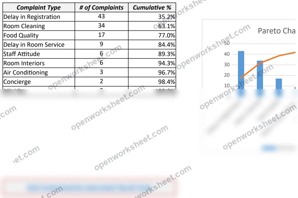
Dynamic Pareto Chart
Identify top complaint drivers with automated Pareto analysis and visual prioritization.
This template creates dynamic Pareto charts to visualize the 80/20 principle—showing which complaint types drive the majority of issues. It includes both a simple static version and an advanced interactive version that highlights bars based on a cumulative threshold, helping teams focus on the vital few problems that need attention.
Perfect for quality assurance teams, customer service managers, and process improvement specialists who need to prioritize issues by impact. Eliminates guesswork about which complaints matter most and supports data-driven decision-making for resource allocation.
What's inside
- Cumulative percentage calculations with SUM formulas
- Dynamic bar highlighting based on threshold selection
- Dual chart views (simple and interactive)
- IF/IFERROR logic for conditional bar visibility
- Automated calculations with INDEX/MATCH lookups
Download this and everything else
.xlsx · 2 sheets · includes charts
$29$9once for thousands of templates. No subscription.
- Limited-time offer, normally $29
- One payment, no subscription
- 14-day refund
More in Data Analysis & Visualization
 Data Analysis & Visualization
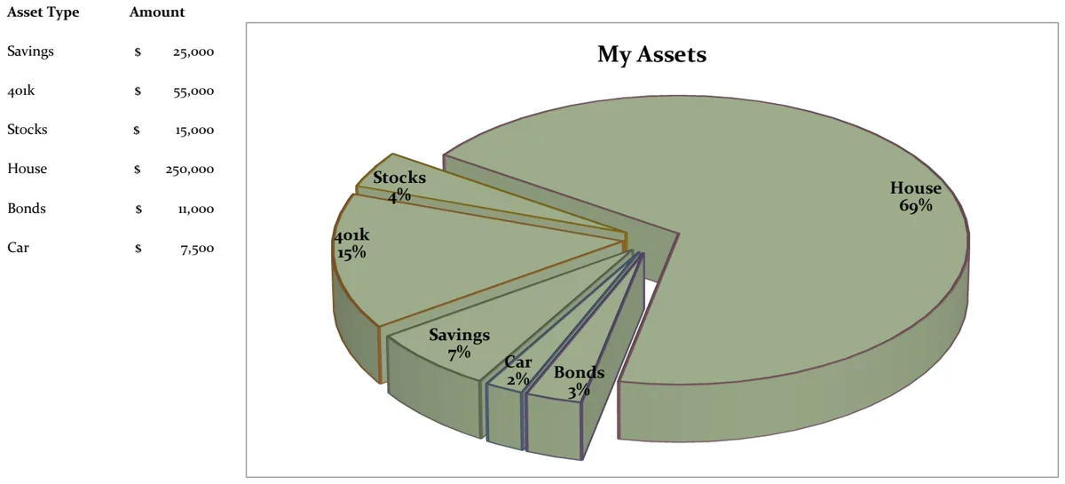
21st Century Asset Allocation Pie Chart
Visualize your net worth distribution across asset types with an interactive pie chart.
- Automatic pie chart generation
- Asset type and amount input fields
- Dynamic percentage calculations
 Data Analysis & Visualization
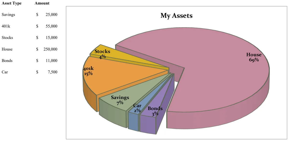
21st Century Pie Chart - Asset Breakdown
Visualize your asset allocation across savings, investments, and retirement accounts with an interactive pie chart.
- Pie chart visualization of asset distribution
- Asset type categorization
- Amount tracking by asset class
 Data Analysis & Visualization
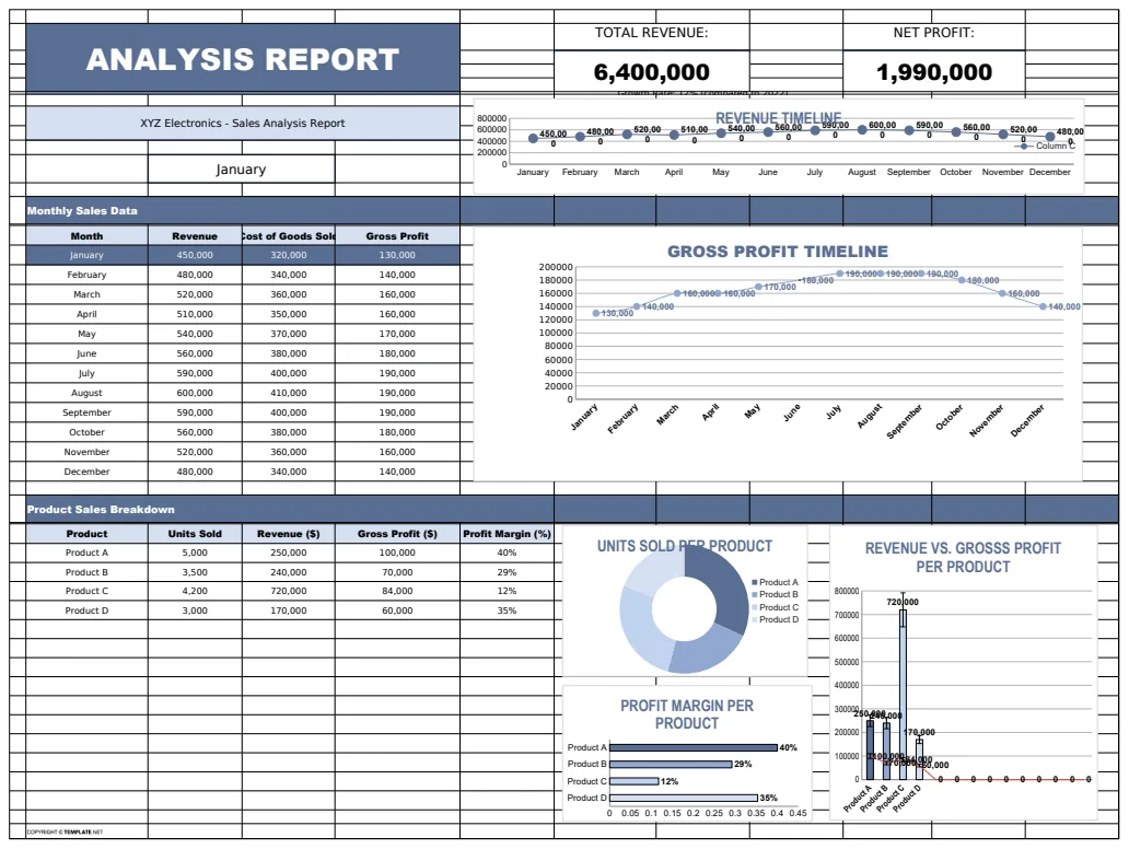
Analysis Report Template
A comprehensive analysis report template for tracking and visualizing business metrics like revenue and profit.
- Revenue tracking
- Profit calculation
- Error handling with IFERROR
 Data Analysis & Visualization
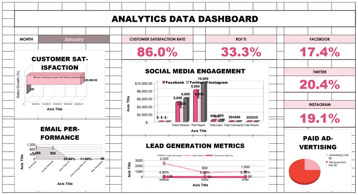
Analytics Data Dashboard
Comprehensive business analytics dashboard tracking customer satisfaction, sales performance, social media engagement, email campaigns, and lead generation metrics with interactive charts and KPI visualizations.
- Pre-built KPI calculations with formulas
- Multi-sheet analytics for different channels
- Social media engagement tracking