Template library
66 templates in this category.
 Data Analysis & Visualization
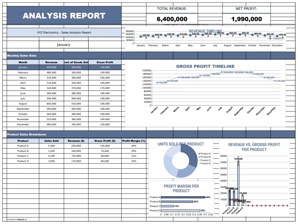
Analysis Report Template
A comprehensive analysis report template for tracking and visualizing business metrics like revenue and profit.
- Revenue tracking
- Profit calculation
- Error handling with IFERROR
 Data Analysis & Visualization
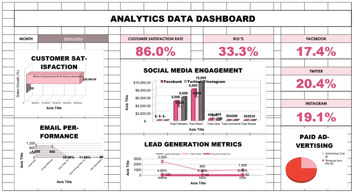
Analytics Data Dashboard
Comprehensive business analytics dashboard tracking customer satisfaction, sales performance, social media engagement, email campaigns, and lead generation metrics with interactive charts and KPI visualizations.
- Pre-built KPI calculations with formulas
- Multi-sheet analytics for different channels
- Social media engagement tracking
 Data Analysis & Visualization
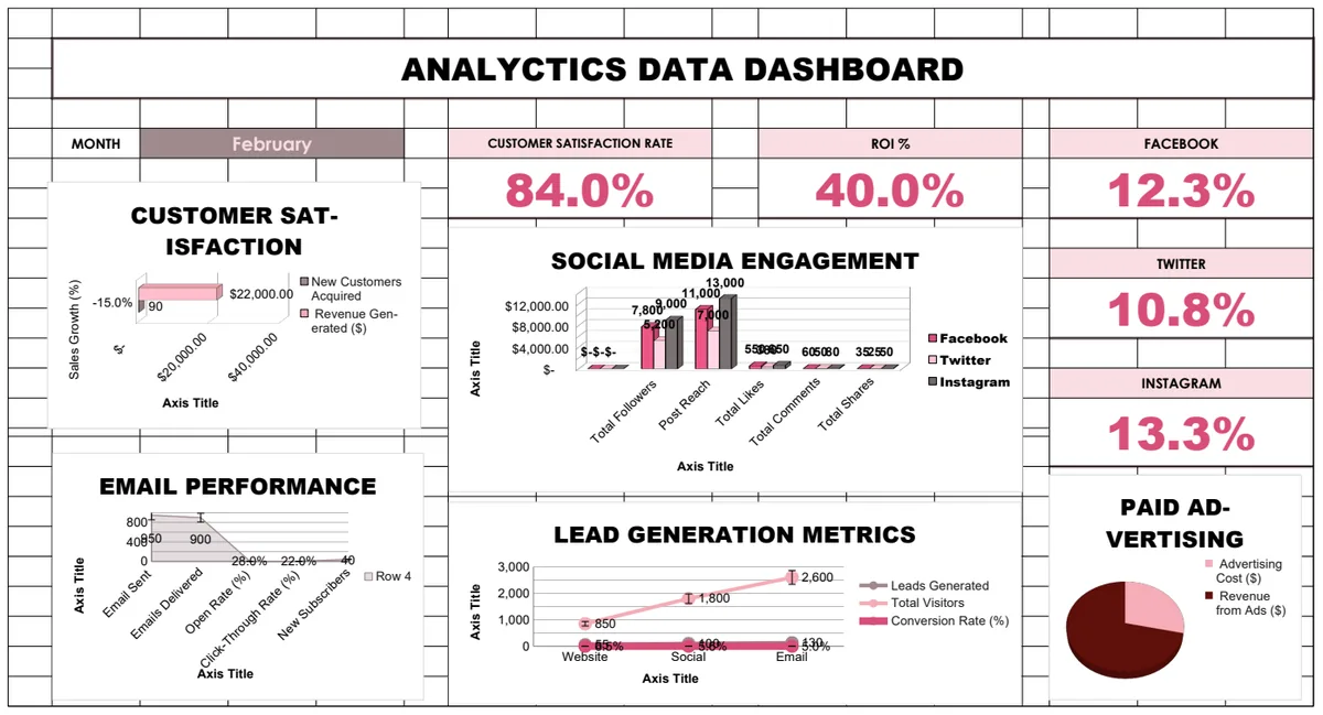
Analytics Data Dashboard
Comprehensive multi-sheet analytics dashboard tracking customer satisfaction, sales performance, social media engagement, email campaigns, and lead generation metrics with automated calculations and visualizations.
- Multi-sheet organization by metric type
- Automated calculations using formulas
- Customer satisfaction tracking
 Data Analysis & Visualization
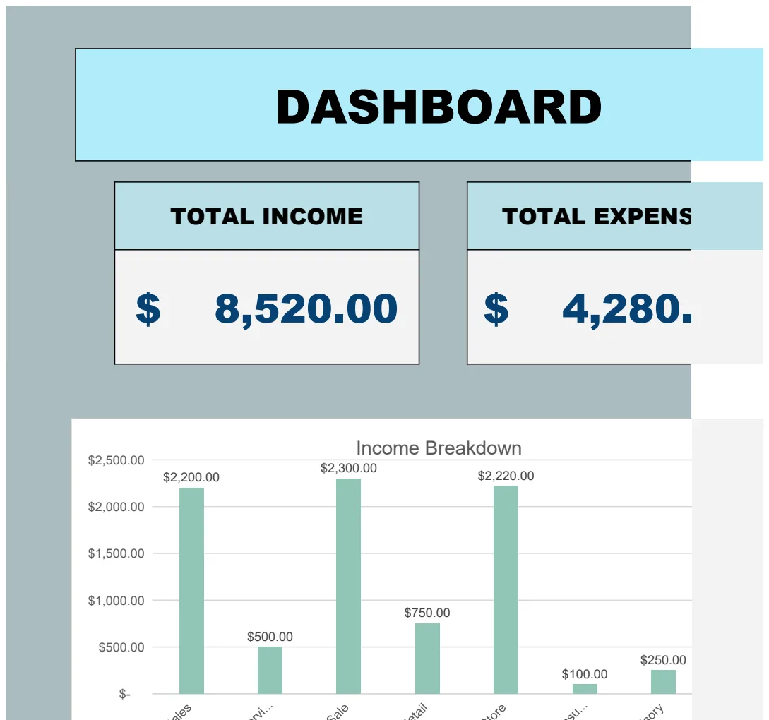
Animated Key Data Dashboard Template
A dynamic business dashboard that tracks and visualizes total income and expenses with animated charts and data summaries.
- Animated dashboard with key metrics display
- Total income and expense calculations
- Income and expense categorization by type
 Data Analysis & Visualization
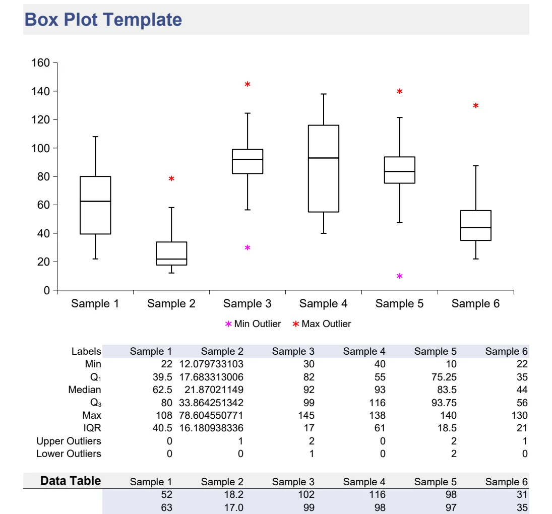
Box Plot Statistical Visualization Template
Create professional box plots to analyze data distribution, identify outliers, and compare statistical ranges visually.
- Multiple box plot layouts (standard and shifted variants)
- Automatic quartile and median calculation
- Data shift capability for comparative analysis
 Data Analysis & Visualization
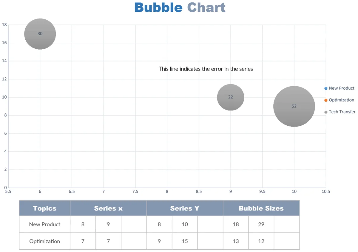
Bubble Chart
Create multi-dimensional bubble charts to visualize relationships between three variables at once.
- Pre-formatted bubble chart framework
- Customizable data axes and bubble sizing
- Color-coded categories
 Data Analysis & Visualization
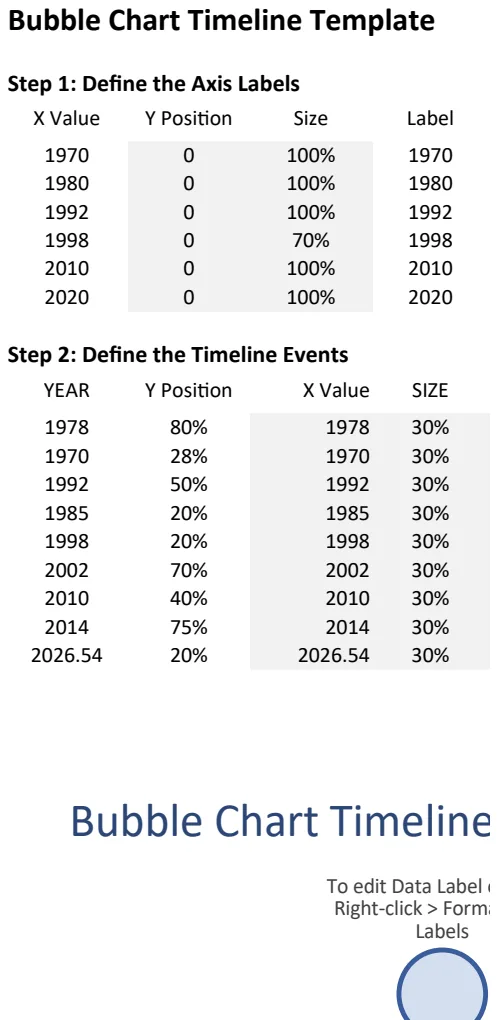
Bubble Chart Timeline Template
Visualize events over time with interactive bubble charts—size and position represent impact and timing.
- Dynamic bubble sizing based on data values
- Automated date-to-X-axis conversion using DAY/MONTH/YEAR functions
- Conditional formatting with IF and ISBLANK logic
 Data Analysis & Visualization
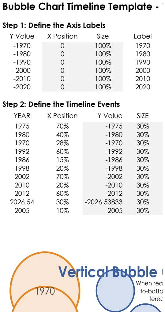
Bubble Chart Timeline Template - Vertical
Visualize events over time with bubble size representing data magnitude using vertical timeline layout.
- Dynamic bubble sizing based on data values
- Automatic date-based X-axis positioning
- Y-axis label customization
 Data Analysis & Visualization
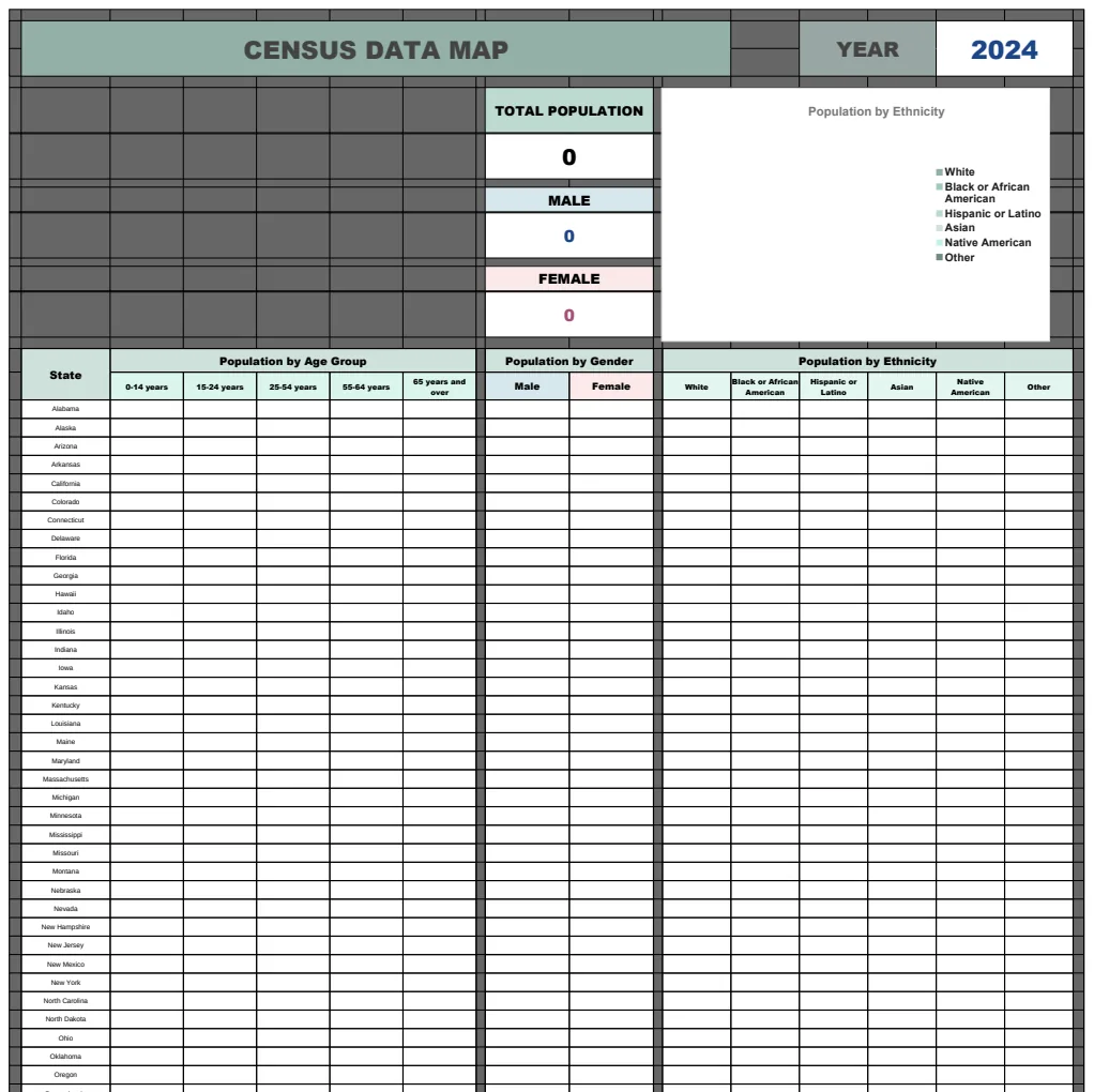
Census Data Map Template
Multi-year census population tracking template with demographic breakdowns and data visualization support.
- Multi-year data sheets (2024, 2025, 2026)
- Demographic categorization (gender, race/ethnicity)
- Automatic population total calculations
 Data Analysis & Visualization
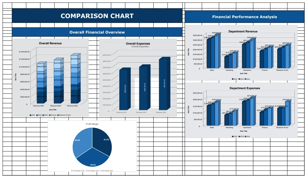
Comparison Chart Template
A financial comparison template with multiple sheets for tracking and visualizing financial performance metrics across departments and years.
- Multi-sheet organization
- Profit margin calculations using IF formulas
- Dynamic data aggregation with SUM functions
 Data Analysis & Visualization
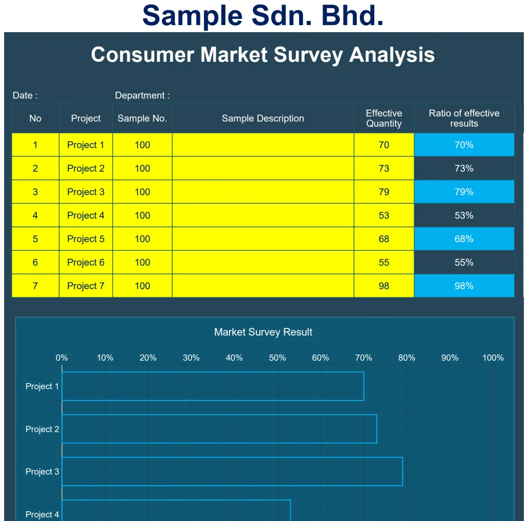
Consumer Market Survey Analysis
Analyze consumer survey data with built-in charts to identify market trends and customer preferences.
- Pre-formatted survey data entry
- Automatic chart generation
- Department and date tracking
 Data Analysis & Visualization
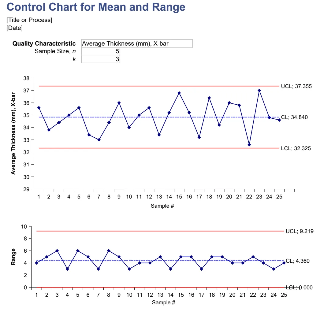
Control Chart (X-bar R and X-bar S)
Track process stability with X-bar R and X-bar S control charts for quality assurance.
- Dual control chart templates (X-bar R and X-bar S)
- Automated control limit calculations using statistical formulas
- Visual charts for trend and anomaly detection
 Data Analysis & Visualization
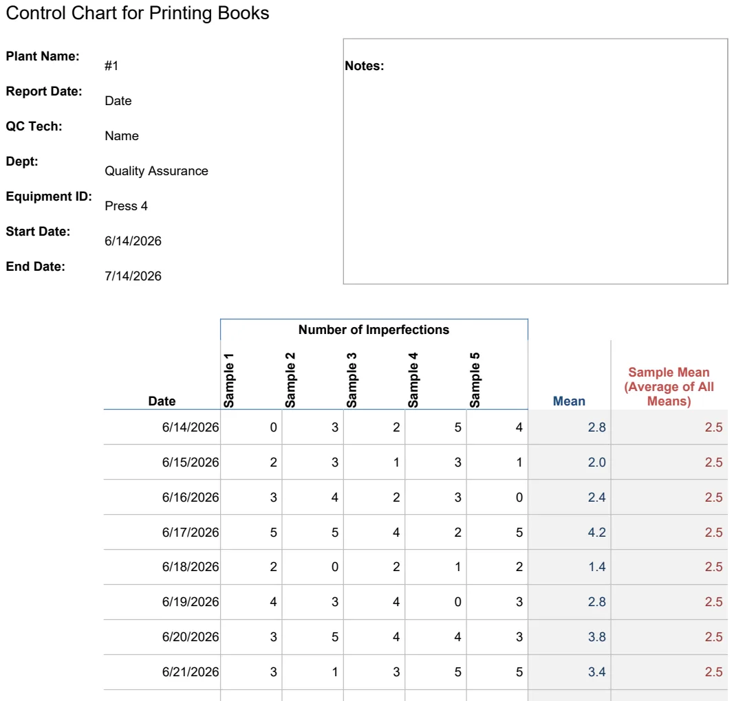
Control Chart for Printing Books
Track printing quality and identify manufacturing defects in book production with statistical control limits.
- Automated control limit calculations
- Date-stamped sample tracking
- Plant location and notes fields
 Data Analysis & Visualization
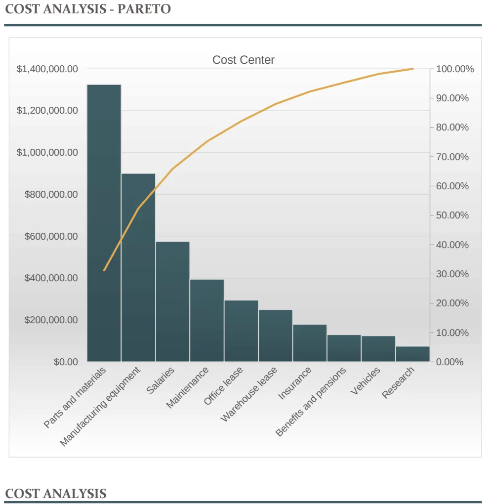
Cost Analysis with Pareto Chart
Visualize cost contributors and cumulative impact using a Pareto chart to identify priority spending areas.
- Automatic cost sorting and ranking
- Cumulative percentage calculation
- Pareto chart visualization
 Data Analysis & Visualization
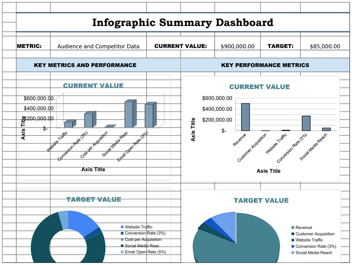
Dashboard Infographic Template
A visual infographic template for displaying key metrics and performance data with summary statistics and charts.
- Visual infographic layout
- Multiple metric displays
- Chart visualizations
 Data Analysis & Visualization
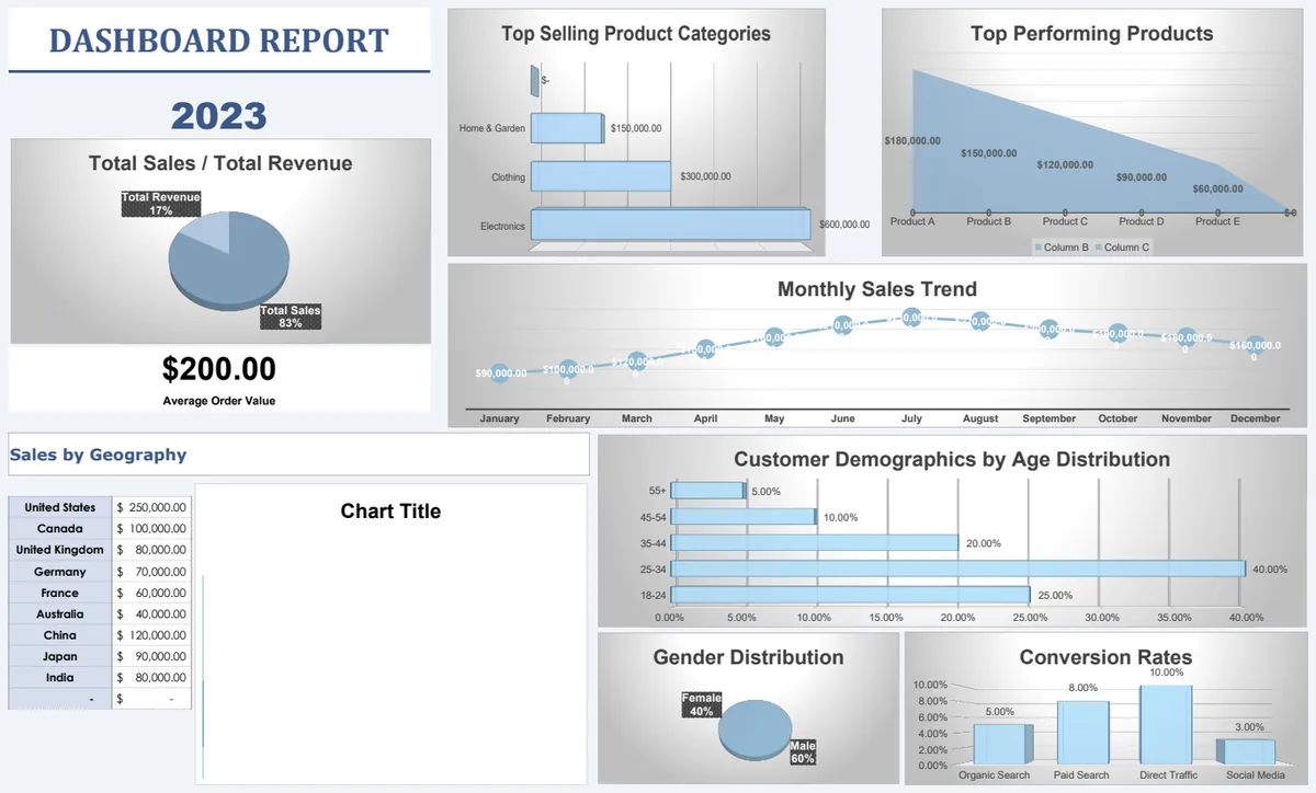
Dashboard Report Template
A comprehensive dashboard reporting system with visual charts tracking key metrics across multiple years.
- Multi-year data organization
- Chart visualization capabilities
- Structured data and support sheets
 Data Analysis & Visualization
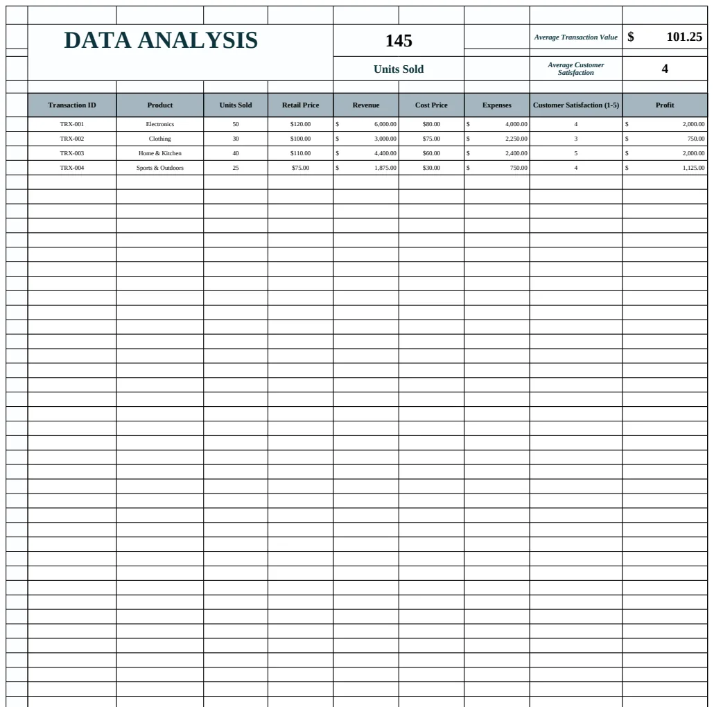
Data Analysis Template
Analyze transaction data with summary metrics including average transaction value, units sold, and revenue calculations.
- SUM function for total calculations
- AVERAGE function for mean values
- IF conditional logic for data categorization
 Data Analysis & Visualization
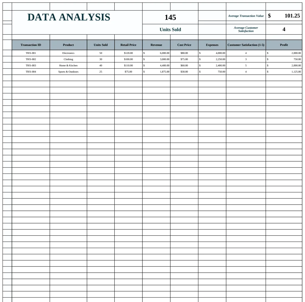
Data Analysis Template
Spreadsheet template for analyzing transaction data with calculations for units sold, revenue, and average transaction values.
- SUM formulas for total revenue and units
- AVERAGE function for transaction value analysis
- COUNTA for transaction counting
 Data Analysis & Visualization
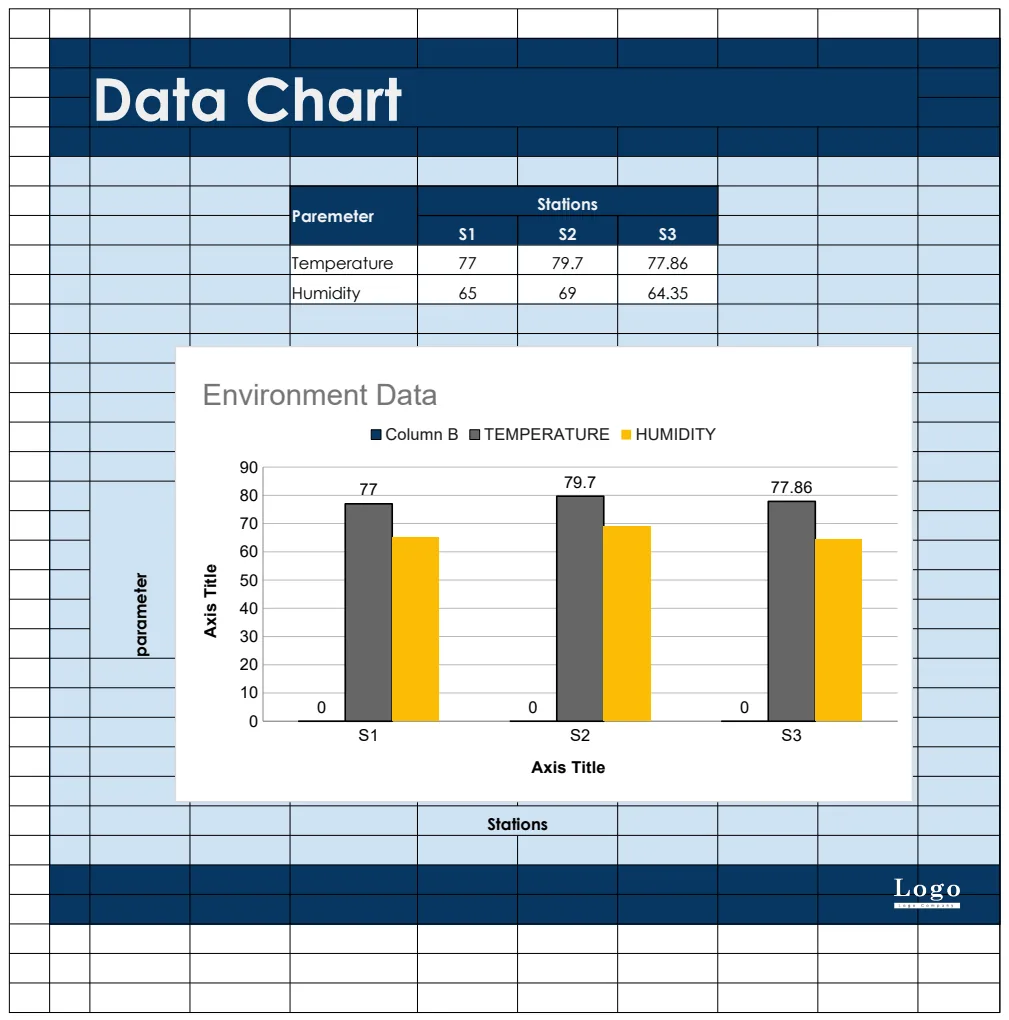
Data Chart
A template for creating and visualizing data charts with parameters and station-based data organization.
- Configurable parameters
- Multi-station data organization
- Chart visualization
 Data Analysis & Visualization
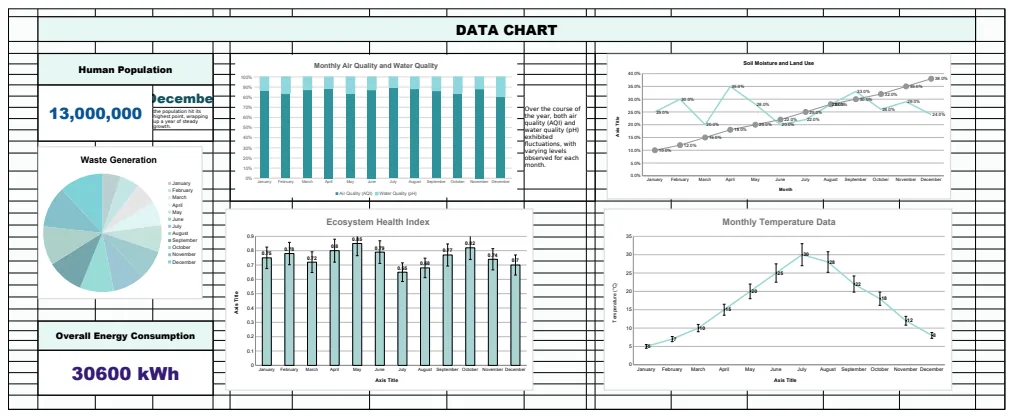
Data Chart Template
A spreadsheet template for visualizing and analyzing data with charts, formulas, and multiple data sources.
- Dynamic charting system
- Array formulas for data aggregation
- COUNTIF function for categorical counting
 Data Analysis & Visualization
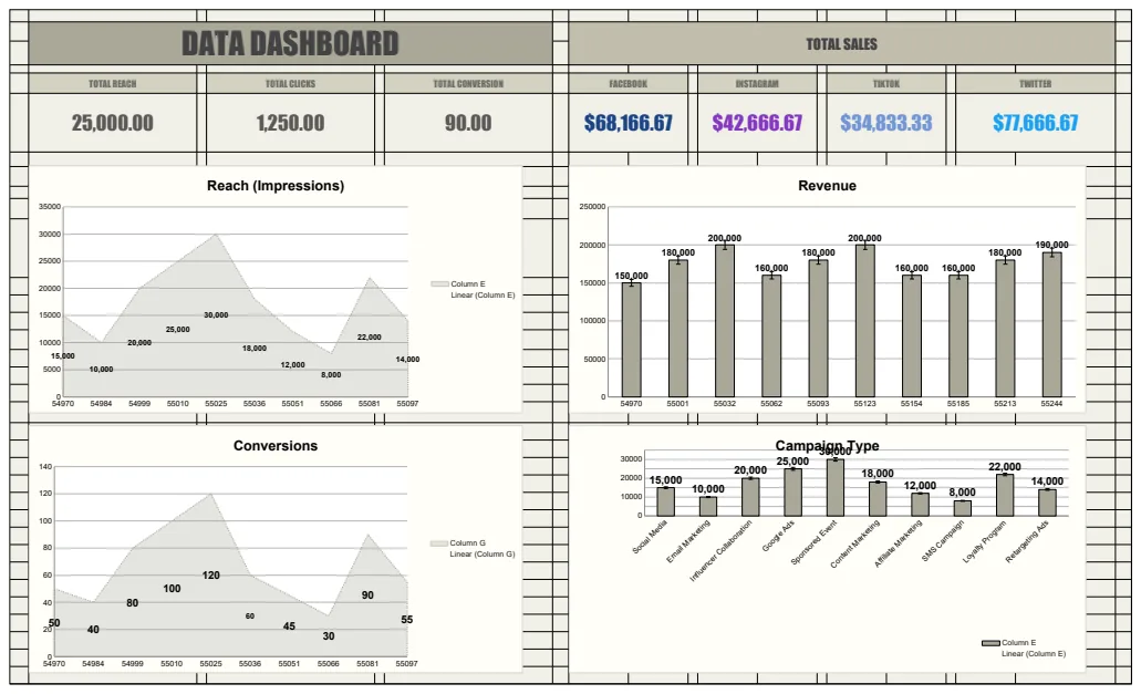
Data Dashboard Template
A comprehensive dashboard template for tracking and visualizing key performance metrics across multiple data sources with real-time calculations and charts.
- Pre-built dashboard layout
- SUM formulas for automatic calculations
- Social media performance metrics
 Data Analysis & Visualization
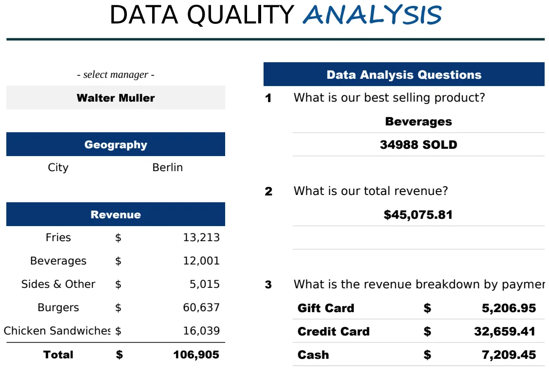
Data Quality Analysis Template
Analyze data quality across sales orders, manager information, and product metrics with integrated lookup and aggregation functions.
- VLOOKUP integration for manager and location data validation
- IF statements for conditional data validation
- SUMIF formulas for product sales aggregation
 Data Analysis & Visualization
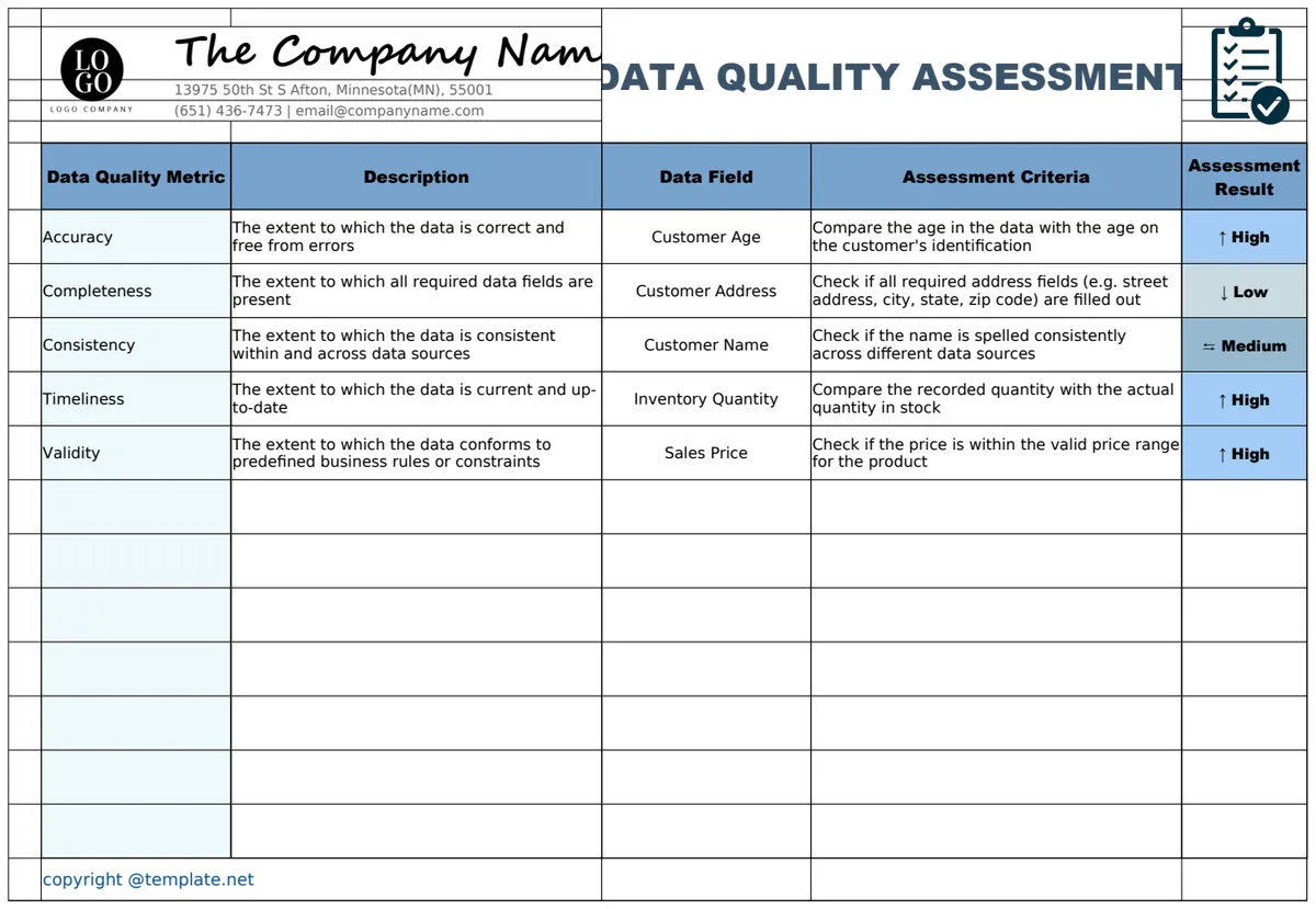
Data Quality Assessment Template
A structured template for evaluating and tracking data quality metrics across business data fields with accuracy, completeness, and consistency measurements.
- Multi-dimensional quality metrics (Accuracy, Completeness, Consistency)
- Data field tracking and assessment
- Results documentation with visual indicators
 Data Analysis & Visualization
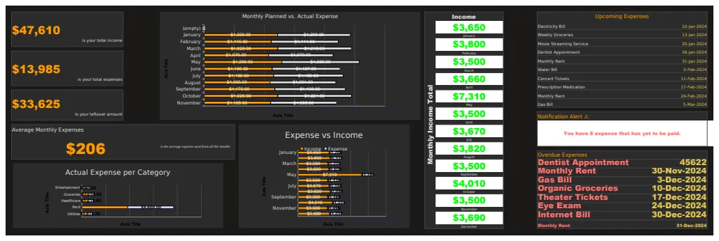
Data Visualization Bar Chart Template
A comprehensive expense and income tracking template with visual bar charts comparing planned vs. actual monthly data.
- Dual tracker sheets for income and expenses
- Monthly summary dashboard with key metrics
- Bar chart visualization of planned vs actual data